Zitti
A dynamic, vibrant, and bureaucracy-free brand.

Year
2025
Category
Naming and Visual Identity
Country
Brazil
Zitti was born with a clear purpose of making life easier for those who need access to real opportunities: in a simpler, faster, and more possible way. Initially in the states of Roraima and Amazonas, Zitti built its foundation with a focus on simplicity, proximity, and trust. More than credit, its commitment is to shorten the distance between people and their dreams, offering autonomy, leadership, and concrete conditions for each individual to move forward safely.
The strategic challenge, diagnosed in the Brand Workshop, was to translate this proposal into a visual expression that combined contemporaneity, technology, and robustness, without losing proximity. As a fintech, Zitti needs to communicate efficiency and security; as a brand aimed at real entrepreneurs, it also needs to convey accessibility and empathy.
The name "Zitti", a short word with a strong sound, carries meanings associated with speed, readiness, and discretion. Thus, it is aligned with the brand's purpose and values: agility and speed in processes for the greatest convenience of clients who have no time to lose. Zitti is global in ambition, but local in action; contemporary in language, but solid in delivery. The visual identity, therefore, needed to reflect this fast pace, this objectivity, and this silent confidence in the result.
The Zitti symbol represents the brand's financial agility, with an inclined geometric construction that conveys movement and advancement. Its shape allows for a conceptual association with the world of finance, referring to the percentage symbol and the logic of rates and calculations, visually translating the mathematical basis of Zitti's solutions. The logo, in turn, expresses dynamism, clarity, and personality in its own typographic signature. Its inclined strokes and angular cuts reinforce movement and agility, while the consistent weight conveys solidity and trust.
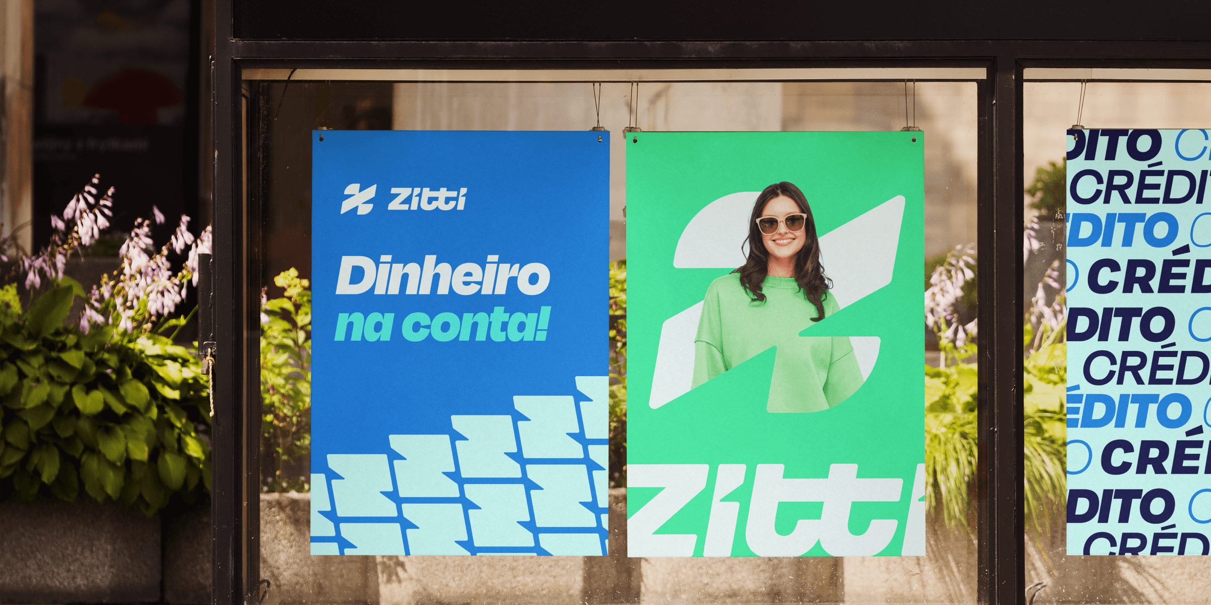
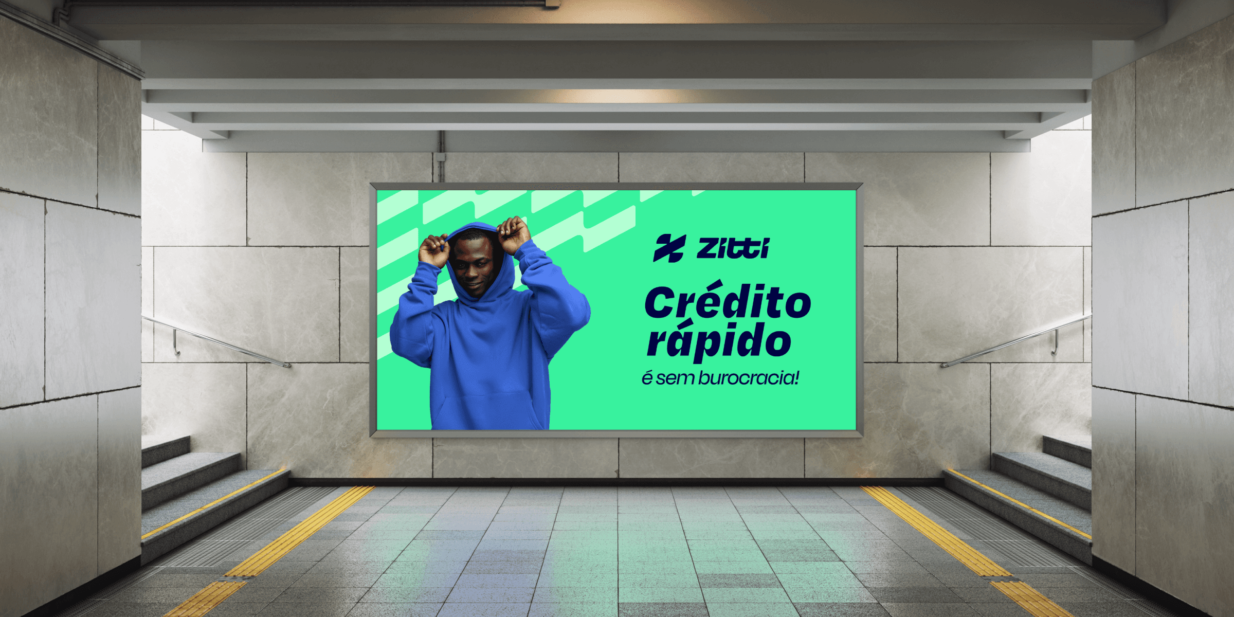
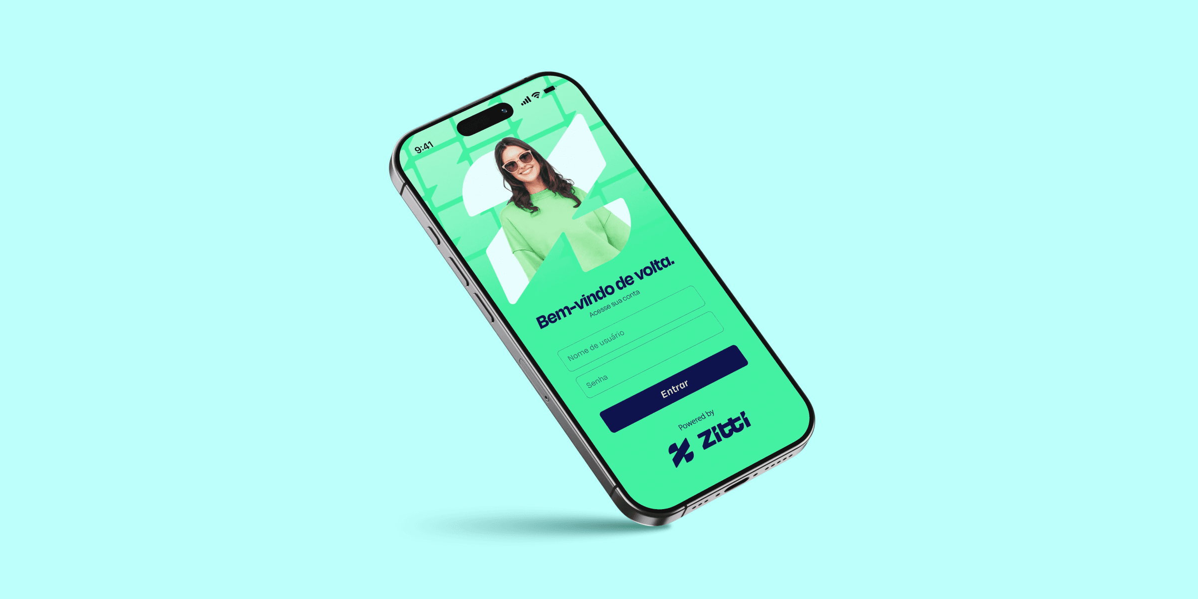
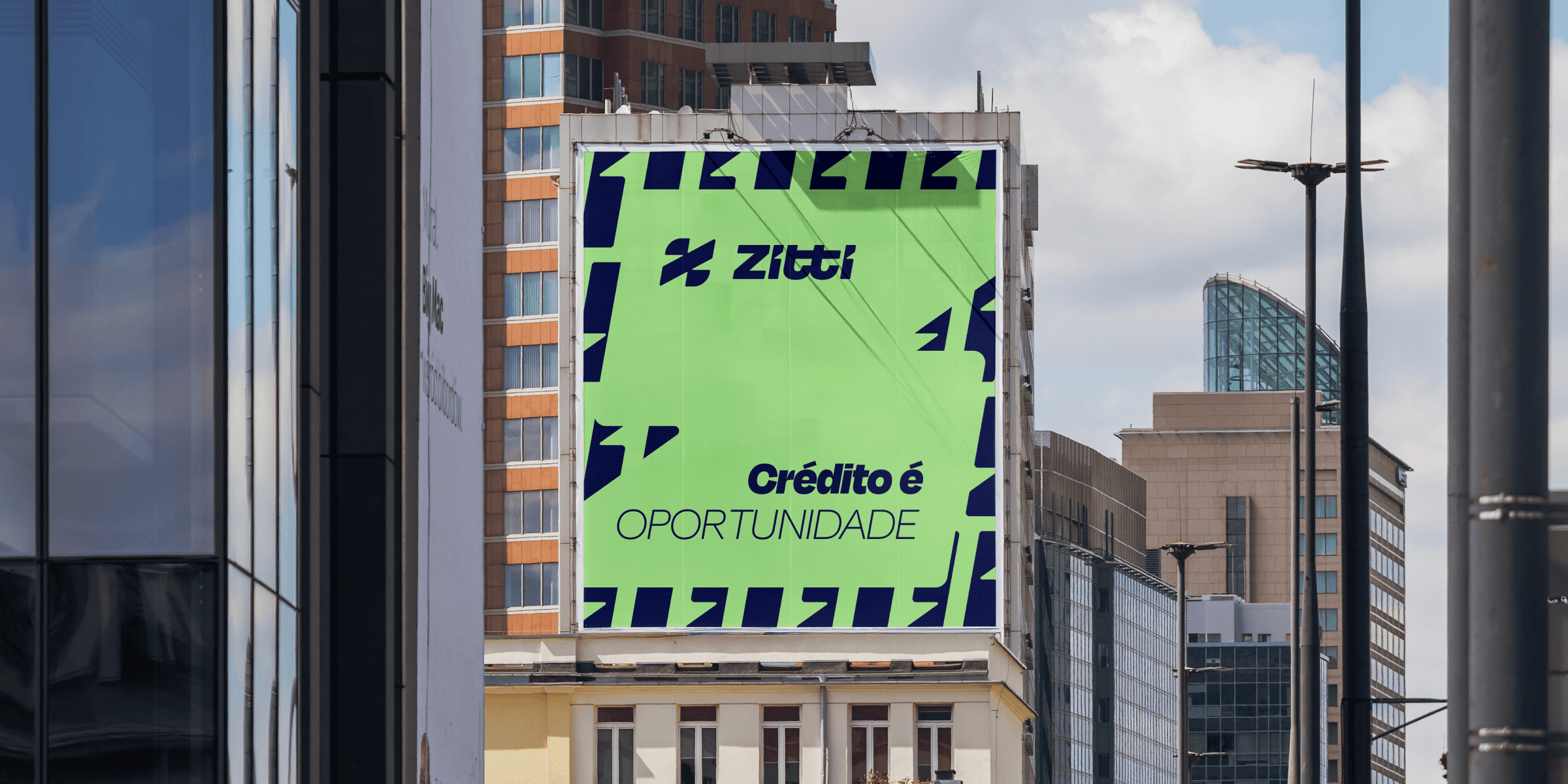
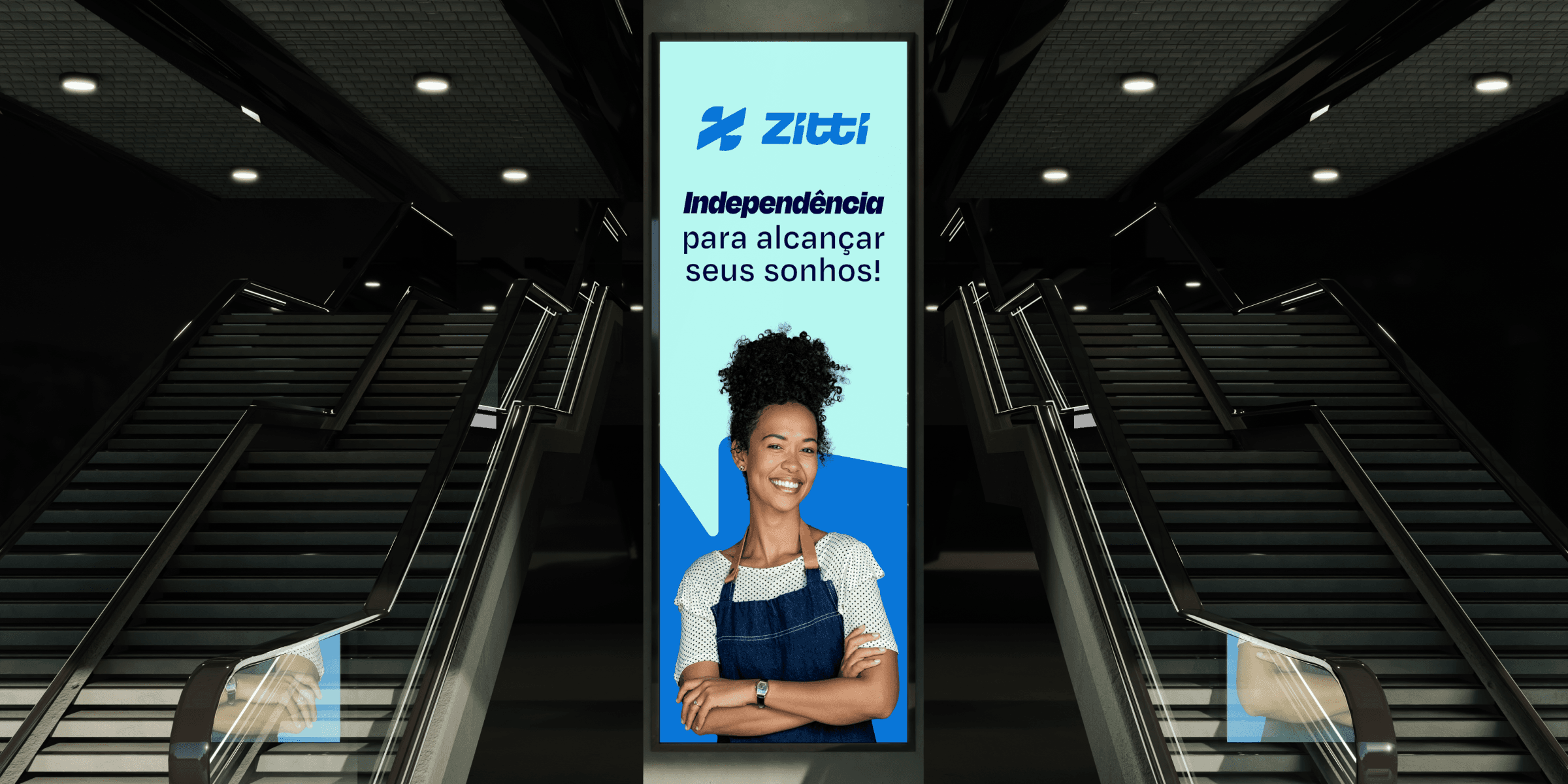
In its applications, the brand demonstrates its strength and versatility. The visual language adapts to different touchpoints, maintaining consistency and impact. Expressions like “Money in the account!” reinforce the benefit offered by Zitti in a direct way, connecting the promise of agility to the client's concrete experience. The identity supports clear, objective, and results-oriented communications, reflecting the proposal to simplify access to credit.
The structural clarity favors intuitive navigation and reinforces the perception of efficiency. At the same time, the urban and contemporary personality brings the brand closer to its audience, speaking to the reality of entrepreneurs who live the dynamism of everyday life. In this way, the brand's structure allows for business scalability — aligning with Zitti's long-term objectives.
The impact of this new visual identity lies in the consolidation of a clear and differentiated positioning. Zitti presents itself as an agile, technological, and reliable fintech, but, above all, as a partner for those seeking to transform plans into achievements. By combining speed and robustness, innovation and proximity, the brand builds a visual expression aligned with its purpose of generating autonomy and expanding opportunities.
A brand prepared to reaffirm that access to opportunities should not be a privilege, but a real possibility.
Zitti was born with a clear purpose of making life easier for those who need access to real opportunities: in a simpler, faster, and more possible way. Initially in the states of Roraima and Amazonas, Zitti built its foundation with a focus on simplicity, proximity, and trust. More than credit, its commitment is to shorten the distance between people and their dreams, offering autonomy, leadership, and concrete conditions for each individual to move forward safely.
The strategic challenge, diagnosed in the Brand Workshop, was to translate this proposal into a visual expression that combined contemporaneity, technology, and robustness, without losing proximity. As a fintech, Zitti needs to communicate efficiency and security; as a brand aimed at real entrepreneurs, it also needs to convey accessibility and empathy.
The name "Zitti", a short word with a strong sound, carries meanings associated with speed, readiness, and discretion. Thus, it is aligned with the brand's purpose and values: agility and speed in processes for the greatest convenience of clients who have no time to lose. Zitti is global in ambition, but local in action; contemporary in language, but solid in delivery. The visual identity, therefore, needed to reflect this fast pace, this objectivity, and this silent confidence in the result.
The Zitti symbol represents the brand's financial agility, with an inclined geometric construction that conveys movement and advancement. Its shape allows for a conceptual association with the world of finance, referring to the percentage symbol and the logic of rates and calculations, visually translating the mathematical basis of Zitti's solutions. The logo, in turn, expresses dynamism, clarity, and personality in its own typographic signature. Its inclined strokes and angular cuts reinforce movement and agility, while the consistent weight conveys solidity and trust.
In its applications, the brand demonstrates its strength and versatility. The visual language adapts to different touchpoints, maintaining consistency and impact. Expressions like “Money in the account!” reinforce the benefit offered by Zitti in a direct way, connecting the promise of agility to the client's concrete experience. The identity supports clear, objective, and results-oriented communications, reflecting the proposal to simplify access to credit.
The structural clarity favors intuitive navigation and reinforces the perception of efficiency. At the same time, the urban and contemporary personality brings the brand closer to its audience, speaking to the reality of entrepreneurs who live the dynamism of everyday life. In this way, the brand's structure allows for business scalability — aligning with Zitti's long-term objectives.
The impact of this new visual identity lies in the consolidation of a clear and differentiated positioning. Zitti presents itself as an agile, technological, and reliable fintech, but, above all, as a partner for those seeking to transform plans into achievements. By combining speed and robustness, innovation and proximity, the brand builds a visual expression aligned with its purpose of generating autonomy and expanding opportunities.
A brand prepared to reaffirm that access to opportunities should not be a privilege, but a real possibility.