Urbit
New times, new resources to learn

Year
2025
Category
Brand Identity
Country
Brazil
Here, English is not memorized. It is understood, lived, and mastered.
Urbit is born directly from Urban Camp, incorporating part of its name and strengthening this connection through its Visual Signature. Its purpose is to convey to parents a genuine commitment to a truly differentiated English teaching proposal: uniting a solid neurolinguistic foundation with technology and Artificial Intelligence, to personalize trajectories, reinforce skills, and accelerate results.
The new brand emerges as an alternative capable of welcoming a broader audience, preserving the quality and purpose of Urban Camp in a more accessible format. Although it is a natural extension of Urban Camp and shares its methodology, Urbit adopts an exclusive approach, differentiating itself visually and strategically, without losing the essence of the parent brand that originated it. Thus, the central challenge of the project was to balance proximity and differentiation.
The creative process involved over a hundred versions until the final solution was reached. Each alternative tested contributed to refining proportions, chromatic relationships, and visual language, ensuring that the final result was not only aesthetically appealing, but strategically coherent.
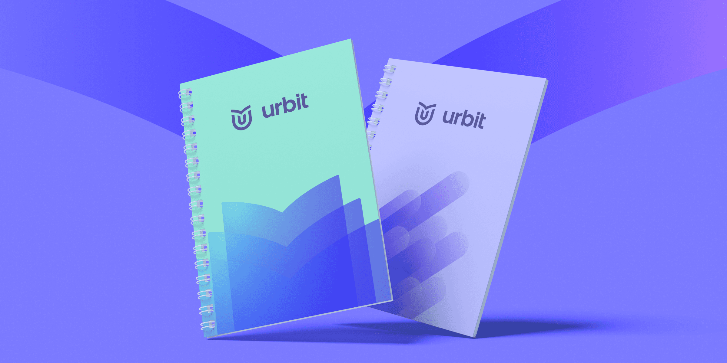
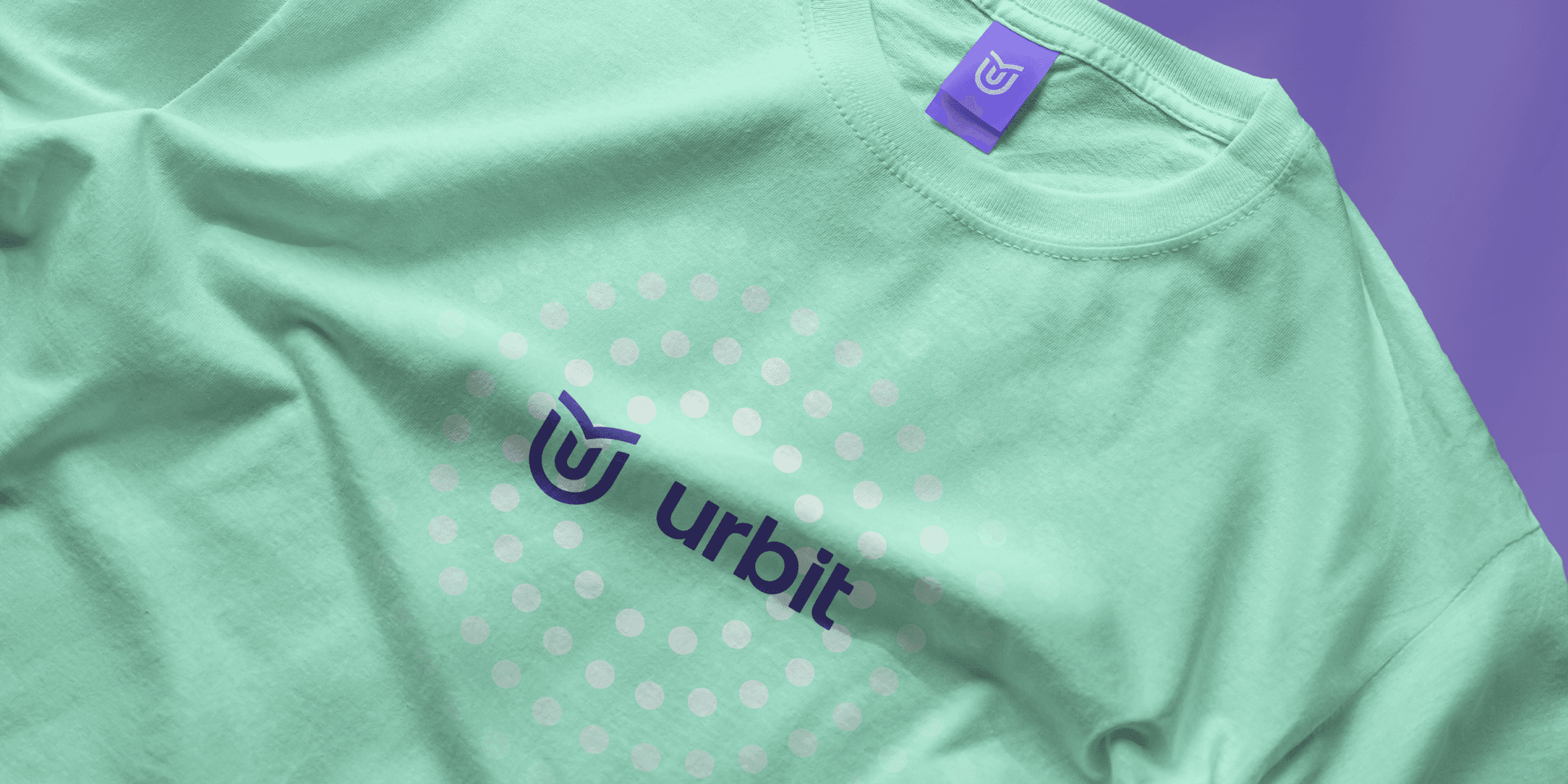
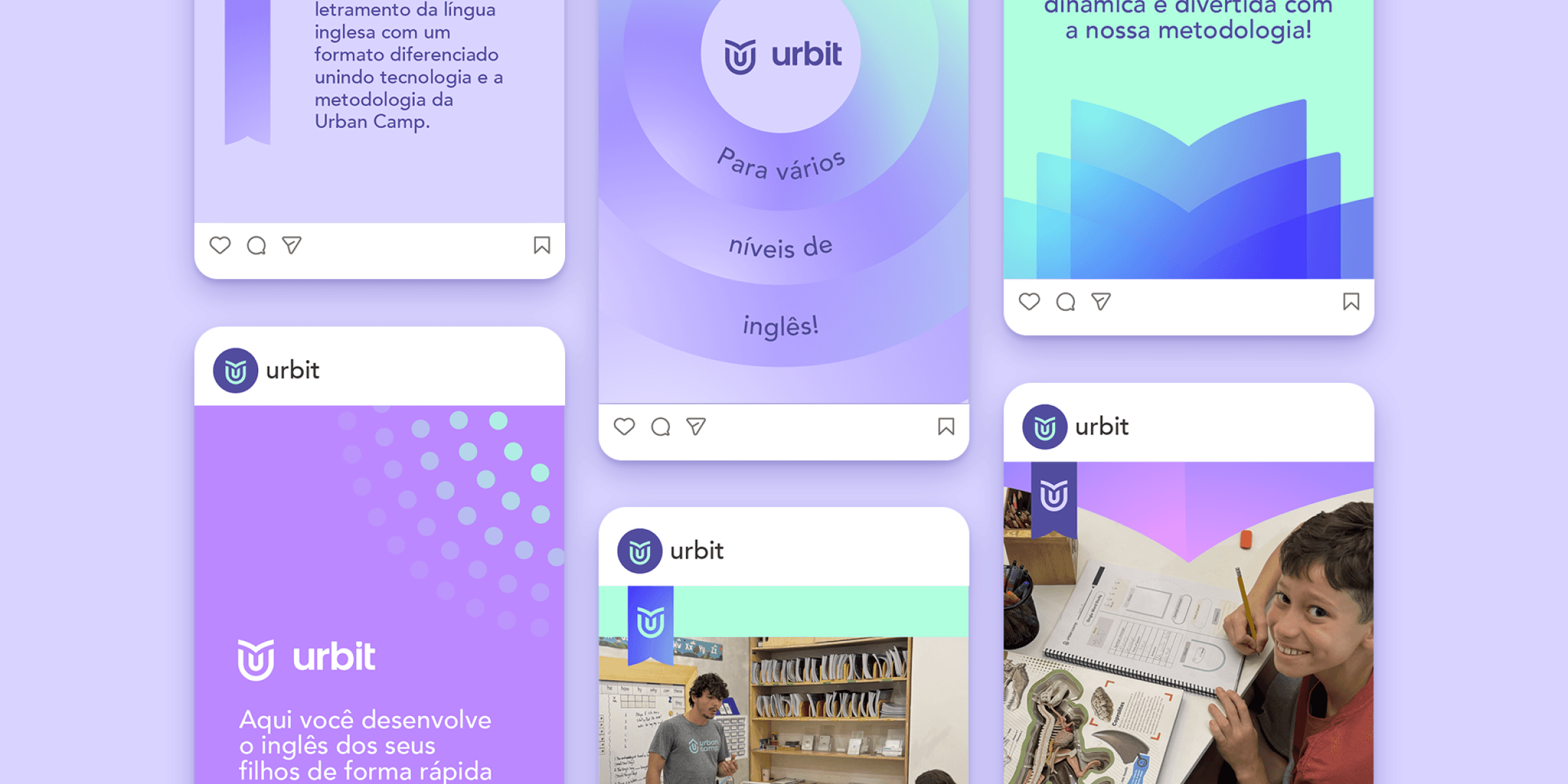
The visual signature establishes proximity to the Urban Camp brand by maintaining the characteristic shape of the "U" in the symbol and the typographic family of the logo. At the top of the symbol, the "book" shape directly refers to Urbit's intention to establish itself as an English course, unlike Urban Camp, which has a different learning proposal.
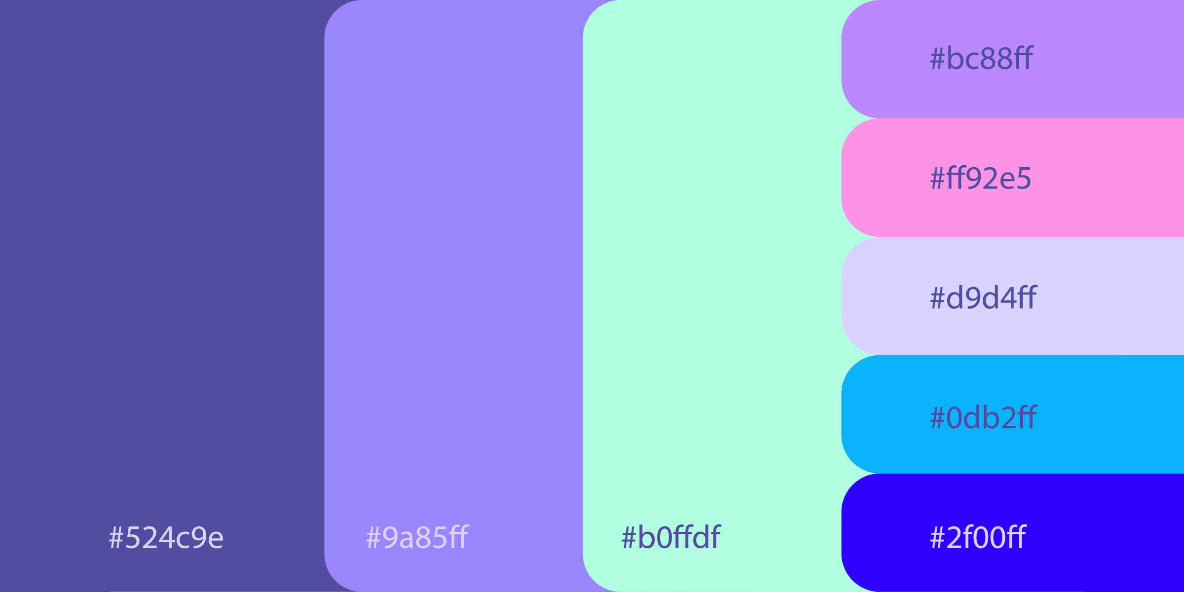
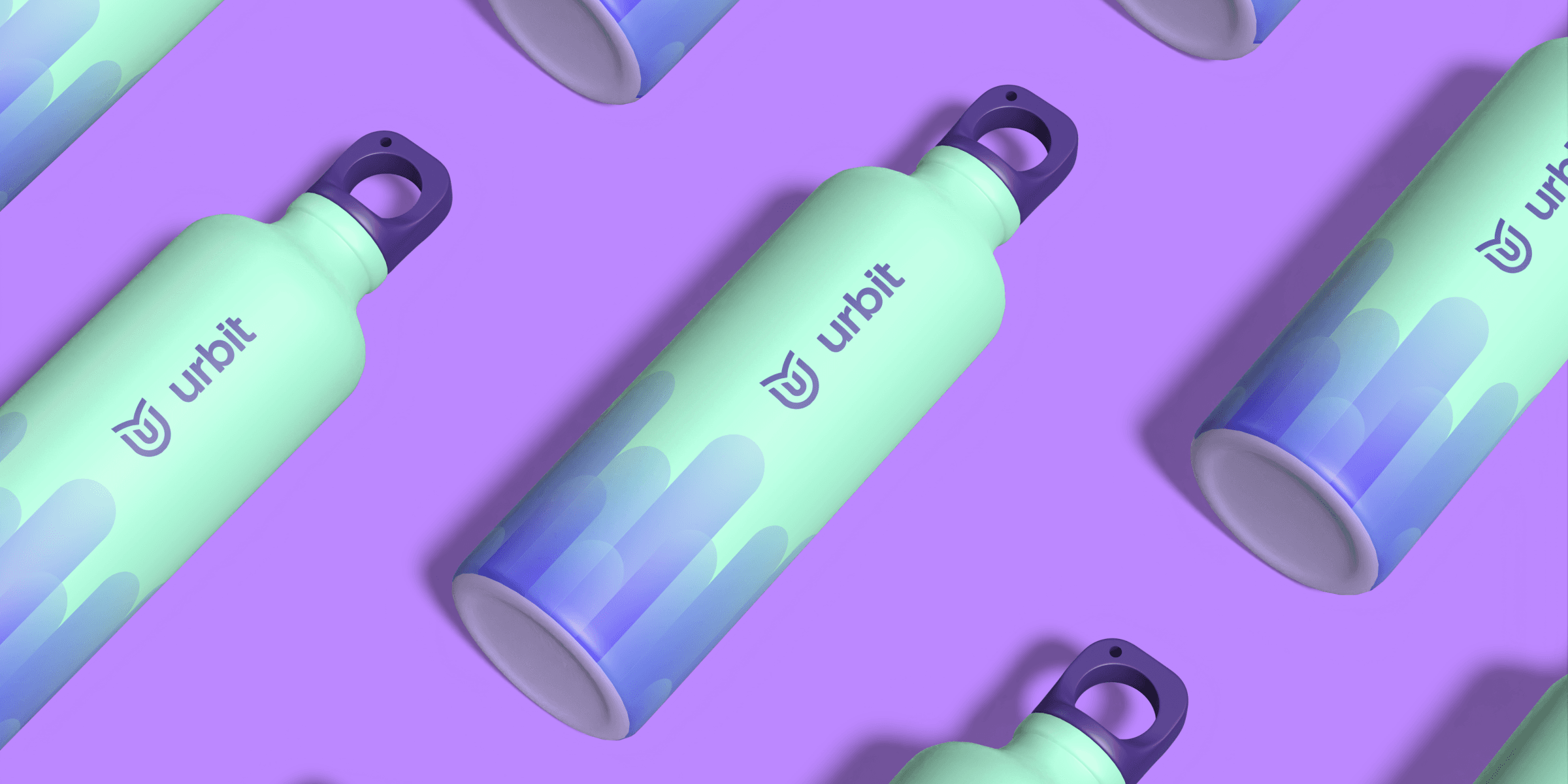
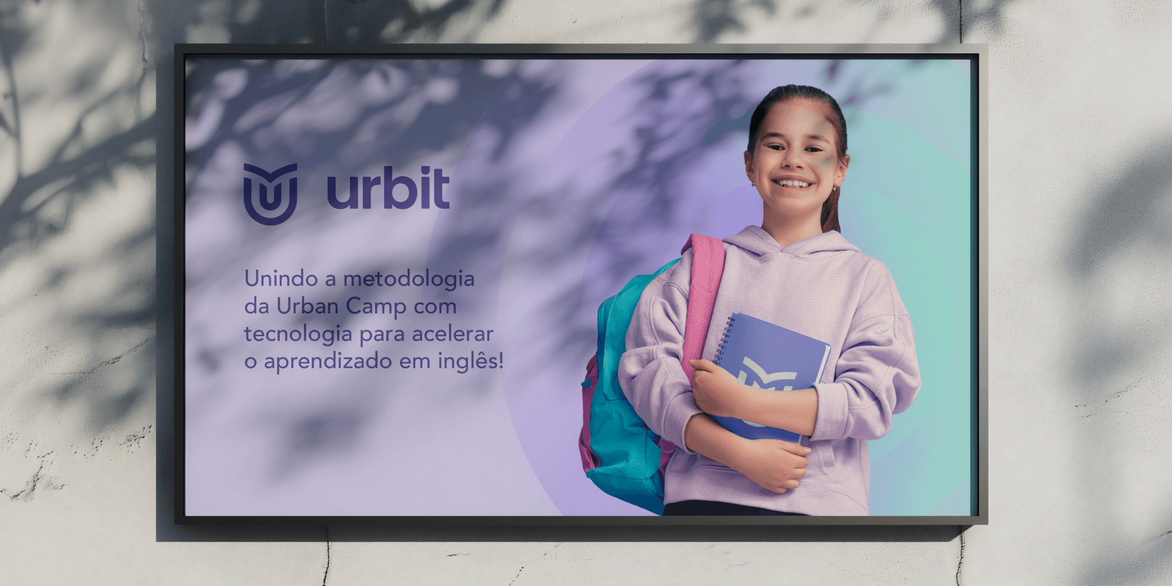
The chromatic palette plays a central role in brand differentiation. Urbit's identity relies on tones such as deep purple, lilac, mint green, intense blue, and luminous variations transitioning between violet and pink. An energetic combination that expresses the brand's creativity and innovation, attributes that resonate with the educational universe and children and youth audiences, while maintaining a sophistication that conveys trust to parents.
The impact of this new identity lies precisely in its capacity to expand the reach of the Urban Camp methodology, with technological innovations to further personalize learning. By creating Urbit, Urban Camp expands its operations responsibly, without compromising quality or intent. The new brand communicates warmth, opportunity, and continuity. It responds to a latent desire of the public and transforms this demand into a concrete proposal, sustained by strategy and visual coherence.
Here, English is not memorized. It is understood, lived, and mastered.
Urbit is born directly from Urban Camp, incorporating part of its name and strengthening this connection through its Visual Signature. Its purpose is to convey to parents a genuine commitment to a truly differentiated English teaching proposal: uniting a solid neurolinguistic foundation with technology and Artificial Intelligence, to personalize trajectories, reinforce skills, and accelerate results.
The new brand emerges as an alternative capable of welcoming a broader audience, preserving the quality and purpose of Urban Camp in a more accessible format. Although it is a natural extension of Urban Camp and shares its methodology, Urbit adopts an exclusive approach, differentiating itself visually and strategically, without losing the essence of the parent brand that originated it. Thus, the central challenge of the project was to balance proximity and differentiation.
The creative process involved over a hundred versions until the final solution was reached. Each alternative tested contributed to refining proportions, chromatic relationships, and visual language, ensuring that the final result was not only aesthetically appealing, but strategically coherent.
The visual signature establishes proximity to the Urban Camp brand by maintaining the characteristic shape of the "U" in the symbol and the typographic family of the logo. At the top of the symbol, the "book" shape directly refers to Urbit's intention to establish itself as an English course, unlike Urban Camp, which has a different learning proposal.
The chromatic palette plays a central role in brand differentiation. Urbit's identity relies on tones such as deep purple, lilac, mint green, intense blue, and luminous variations transitioning between violet and pink. An energetic combination that expresses the brand's creativity and innovation, attributes that resonate with the educational universe and children and youth audiences, while maintaining a sophistication that conveys trust to parents.
The impact of this new identity lies precisely in its capacity to expand the reach of the Urban Camp methodology, with technological innovations to further personalize learning. By creating Urbit, Urban Camp expands its operations responsibly, without compromising quality or intent. The new brand communicates warmth, opportunity, and continuity. It responds to a latent desire of the public and transforms this demand into a concrete proposal, sustained by strategy and visual coherence.