Urban Camp
Learning is a journey

Year
2021
Category
Visual Identity
Country
Brazil
Urban Camp is an English literacy center that developed its own multisensory methodology for teaching children and adolescents. It emerges as an alternative to traditional education, with the aim of developing communication skills, logical reasoning, and socialization in English, awakening in the student the same confidence as a native speaker.
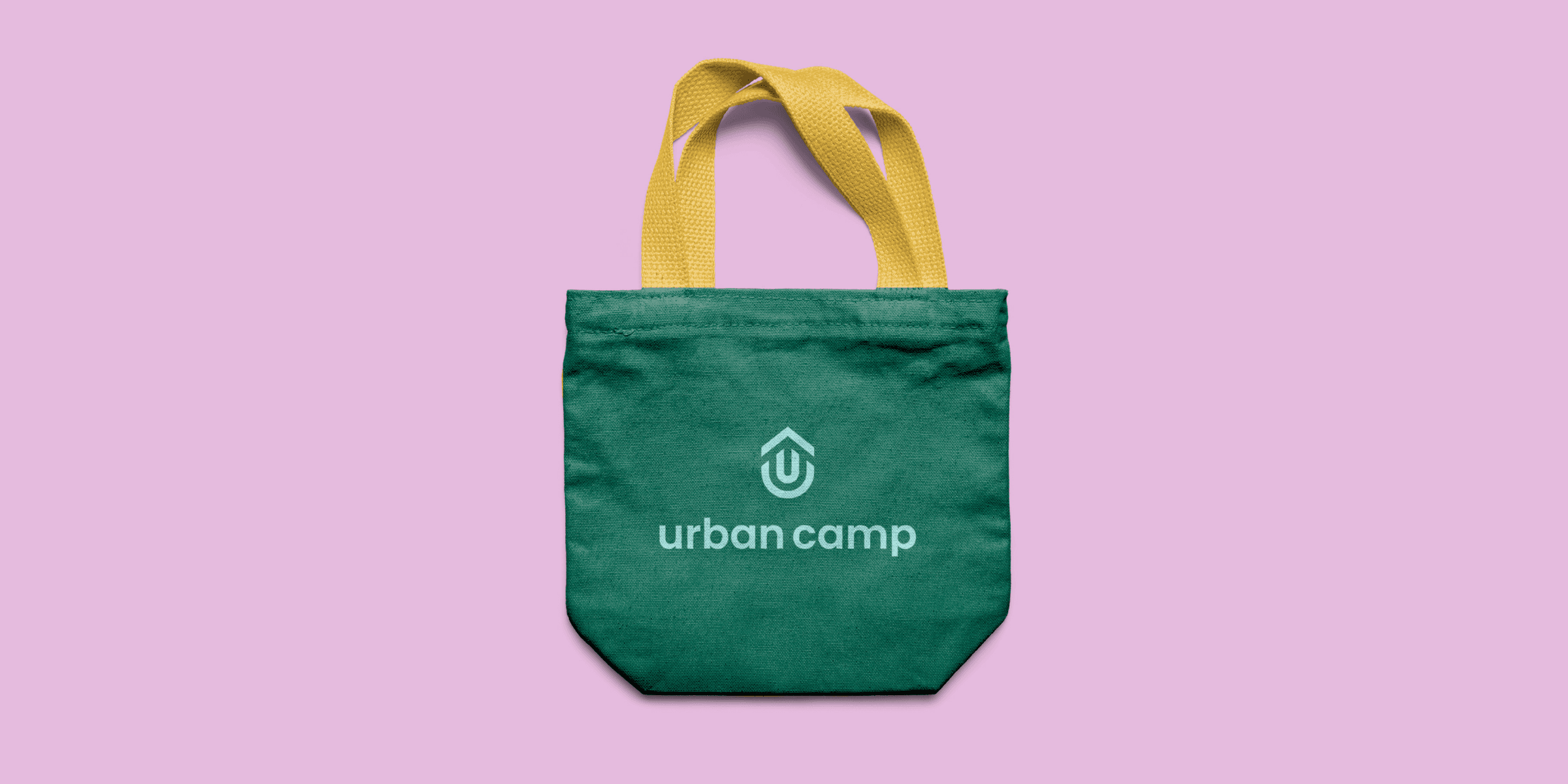
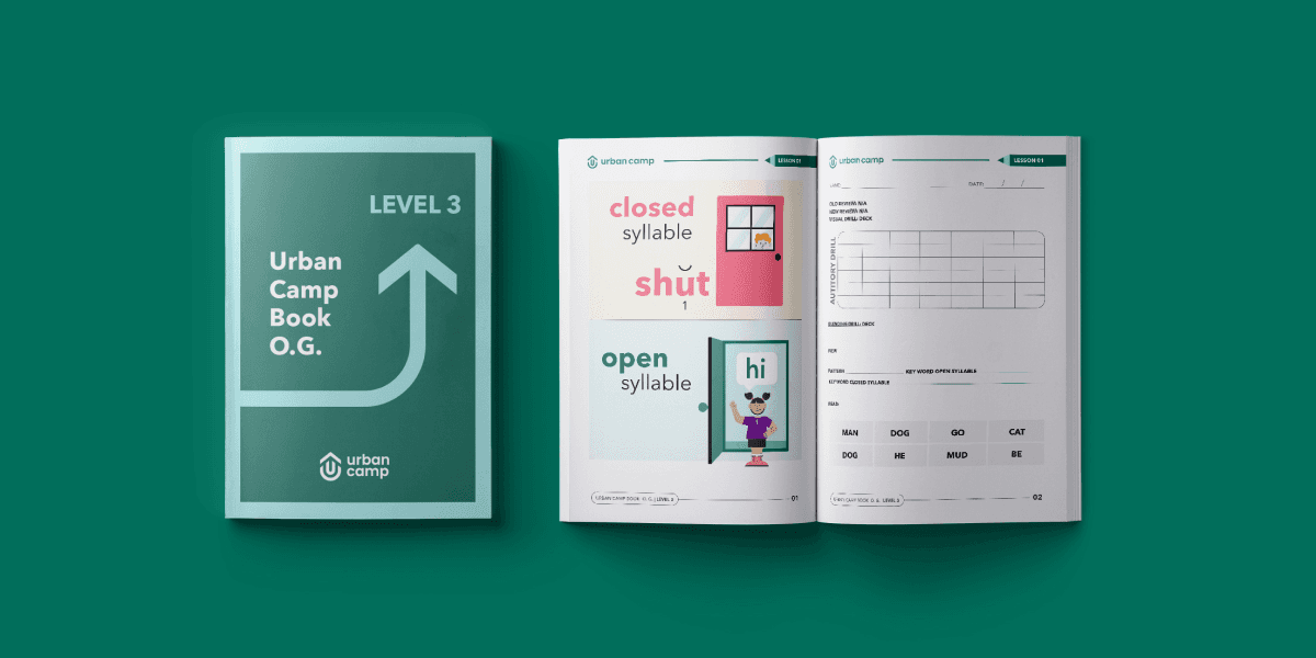
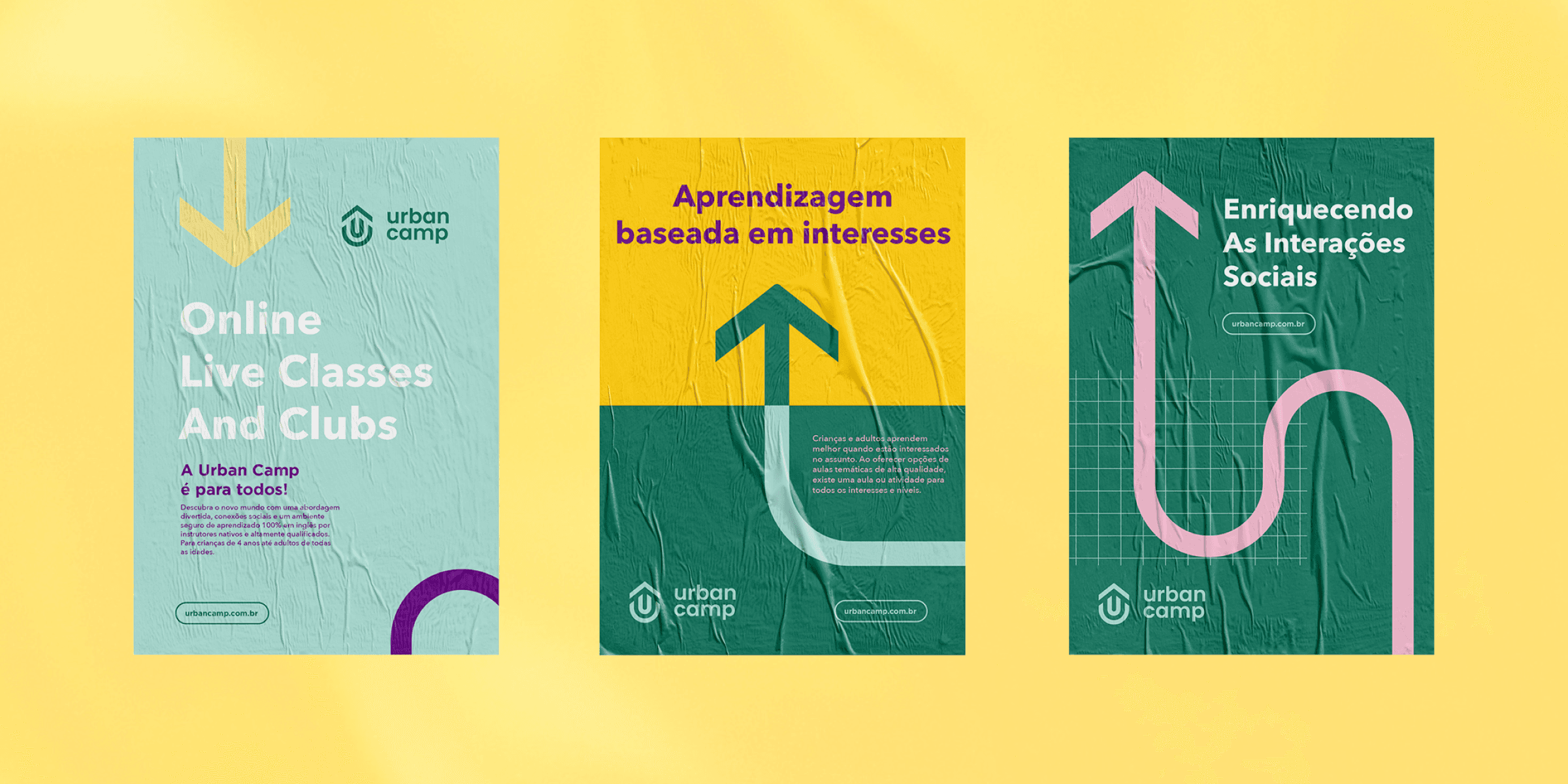
The concept of the visual strategy stemmed from the understanding that learning is a journey. We explored a playful aesthetic, dialoguing with the children's universe without losing the authority of an educational institution. The balance between cheerful colors and institutional green helps create an inviting atmosphere, while the geometric layout conveys seriousness and structure. In this way, it is possible to communicate with audiences of different ages — dialoguing with both children and parents or guardians.
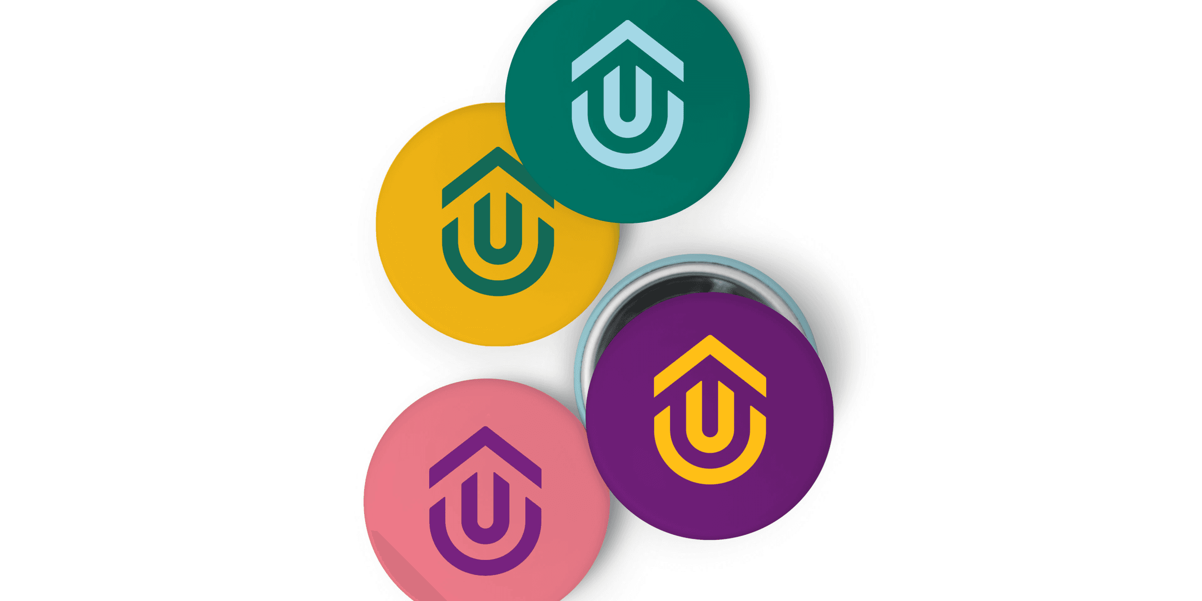
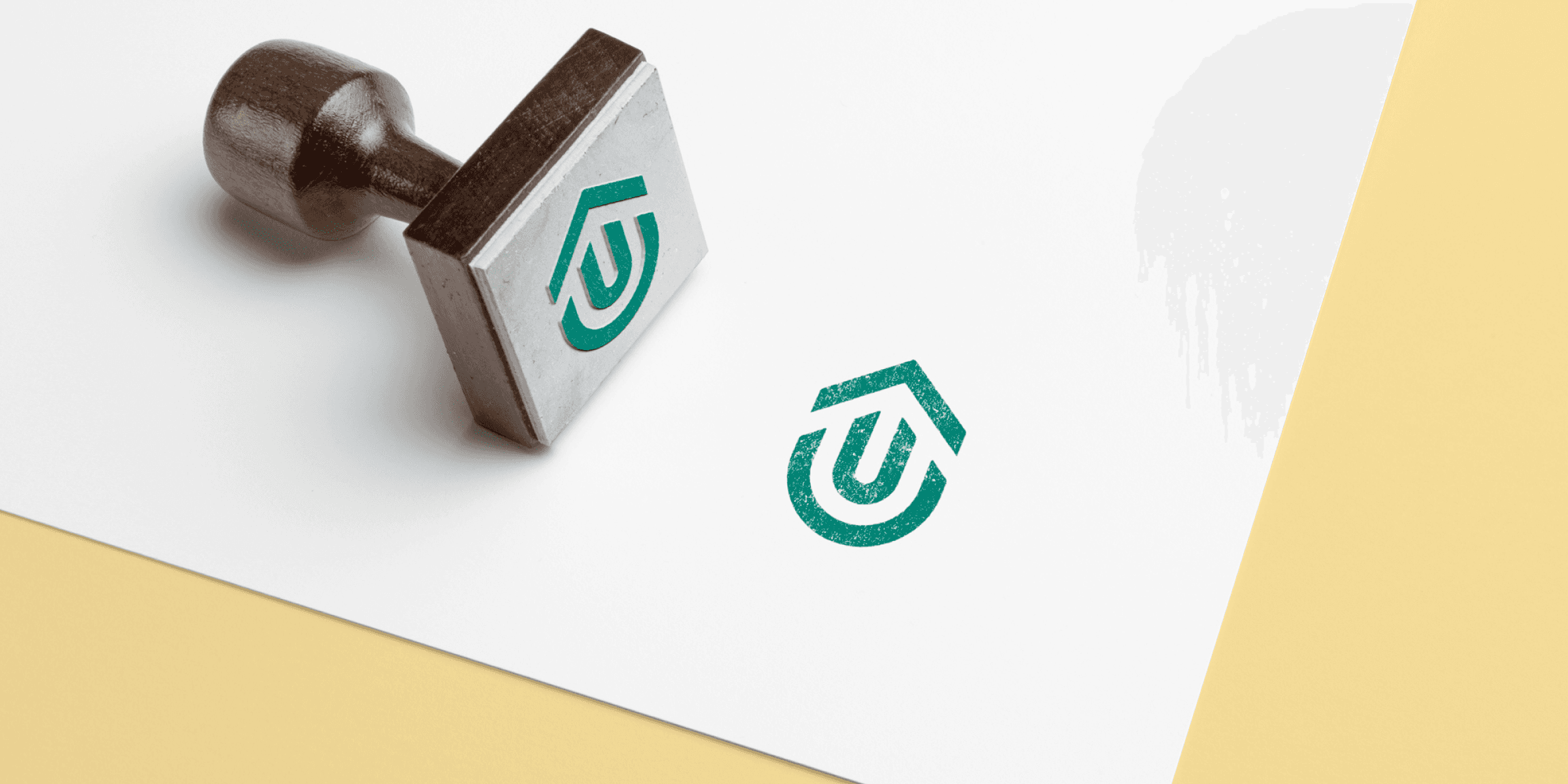
The symbol arises from 3 concepts aligned with the brand's strategy: the book, the tent, and the path — thus revealing the stylized shape of the "U". The logo features a rounded, friendly, sans-serif typography, which is well-aligned with digital media as it conveys modernity and innovation. Together, they build a visual signature consistent with the brand's values and adaptable to the diverse contexts that the immersive methodology can create.
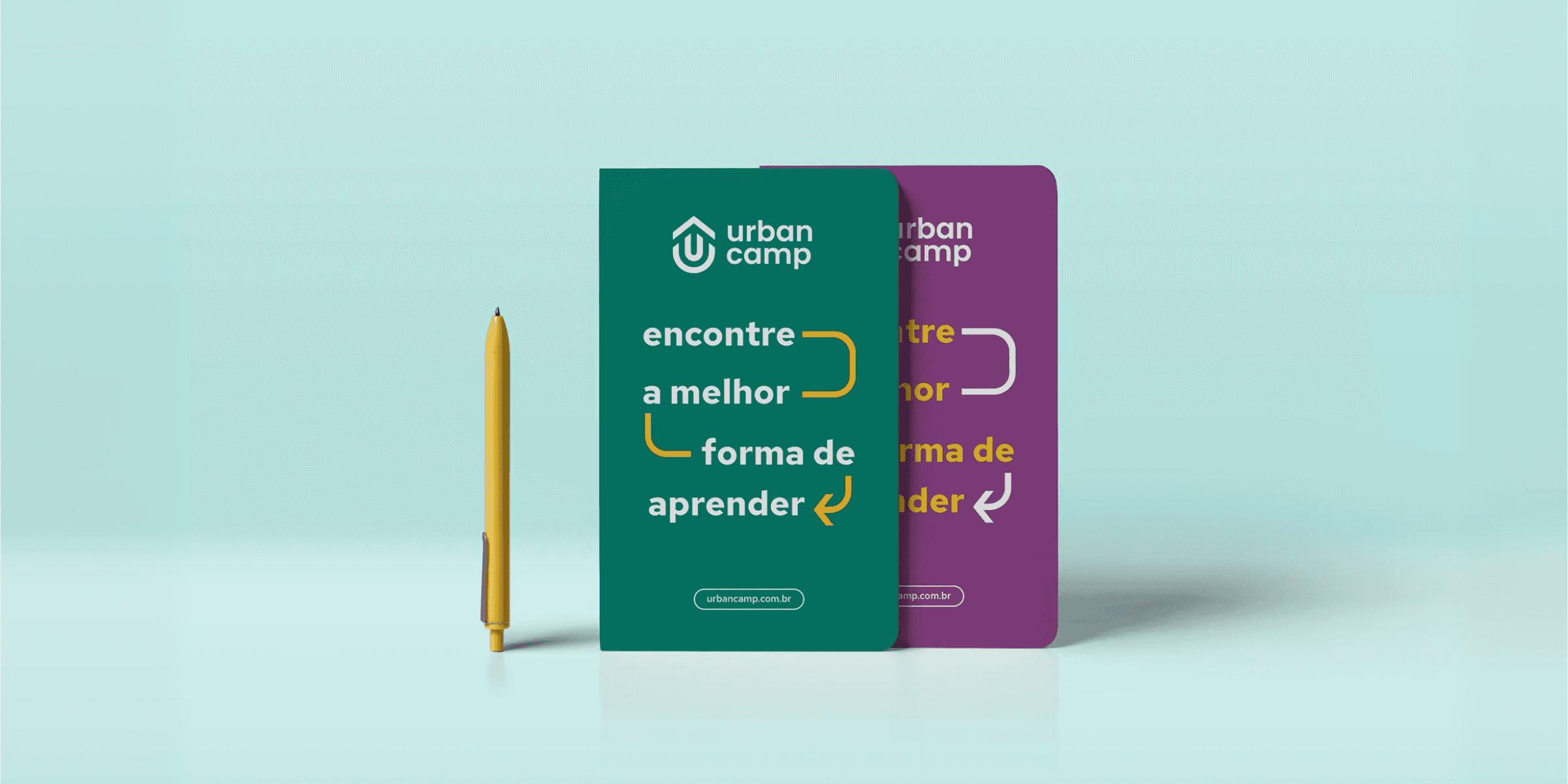
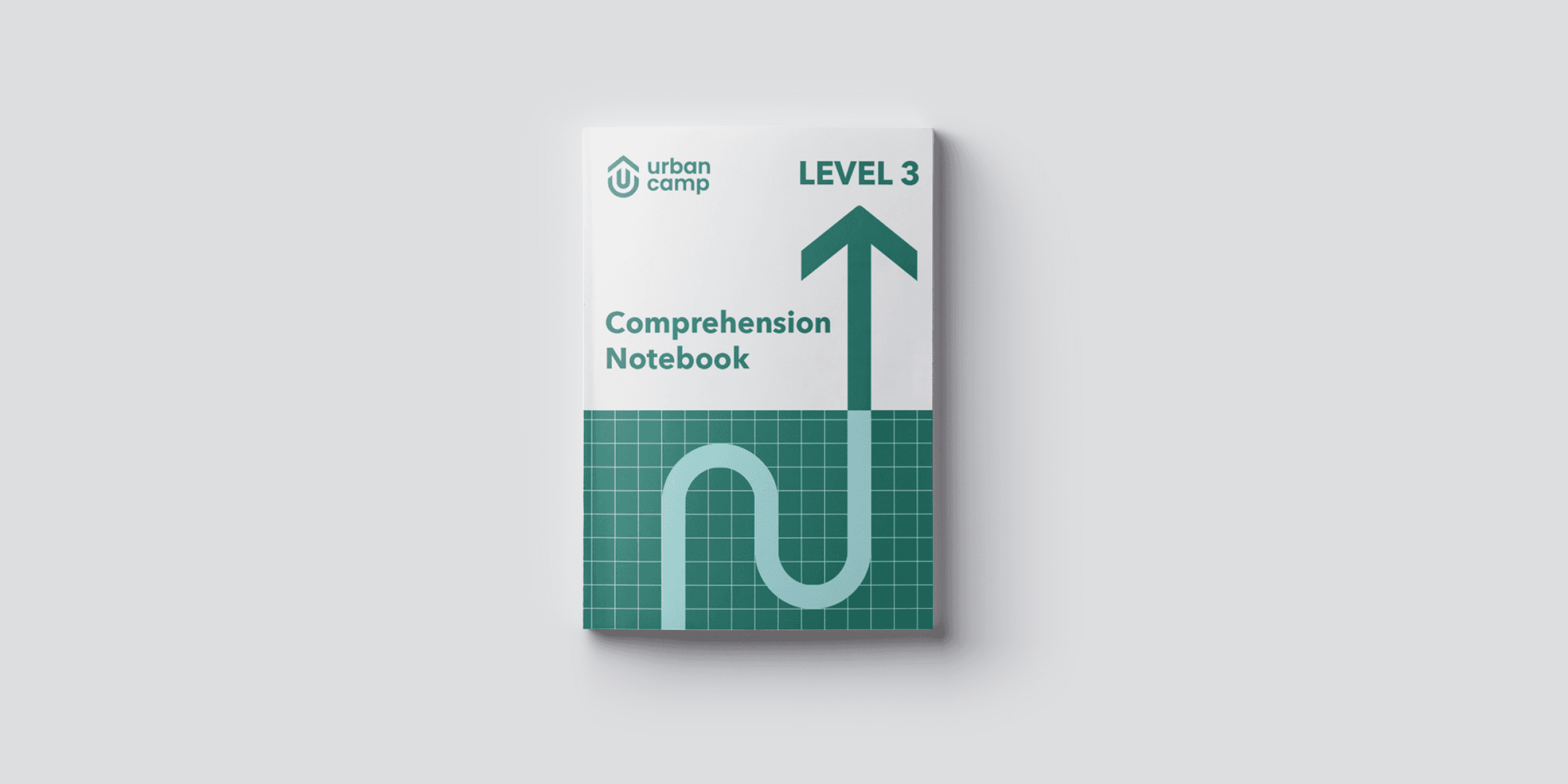
The visual system behaves in an integrated manner across different promotional materials, showing how the identity can support diverse communications without losing unity. By articulating concept and consistent visual expression, the entire brand system allows Urban Camp to differentiate itself in the educational market.
Urban Camp is an English literacy center that developed its own multisensory methodology for teaching children and adolescents. It emerges as an alternative to traditional education, with the aim of developing communication skills, logical reasoning, and socialization in English, awakening in the student the same confidence as a native speaker.
The concept of the visual strategy stemmed from the understanding that learning is a journey. We explored a playful aesthetic, dialoguing with the children's universe without losing the authority of an educational institution. The balance between cheerful colors and institutional green helps create an inviting atmosphere, while the geometric layout conveys seriousness and structure. In this way, it is possible to communicate with audiences of different ages — dialoguing with both children and parents or guardians.
The symbol arises from 3 concepts aligned with the brand's strategy: the book, the tent, and the path — thus revealing the stylized shape of the "U". The logo features a rounded, friendly, sans-serif typography, which is well-aligned with digital media as it conveys modernity and innovation. Together, they build a visual signature consistent with the brand's values and adaptable to the diverse contexts that the immersive methodology can create.
The visual system behaves in an integrated manner across different promotional materials, showing how the identity can support diverse communications without losing unity. By articulating concept and consistent visual expression, the entire brand system allows Urban Camp to differentiate itself in the educational market.