Sociedade Musical Fraternidade Cordeirense
Tradition and innovation to generate impact

Year
2024
Category
Brand Identity
Country
Brazil
Context & Challenge
With a strong cultural and historical presence in the city of Cordeiro, the Sociedade Musical Fraternidade Cordeirense (SMFC) — known as the city's band since 1905 — sought a new visual identity capable of representing its symbolic and social relevance. The challenge was to visually translate the band's tradition without giving up innovation, the diversity of people involved, and the community dynamics that SMFC represents today.
Diagnosis
During the immersion process, it became clear that SMFC goes far beyond musical performances: it is an emotional, collective symbol deeply rooted in the city's life. The brand needed to reflect this multiple role — as a living cultural heritage and a generational meeting point — with a current and accessible language, especially for the new generations, without losing the seriousness and prestige built over more than a century.
Strategy
Among the proposed paths, the chosen one was “Musical Geometrics”. This direction stemmed from the idea of precision and construction — characteristics present in band music — and incorporated formal references to geometry and musical metrics. The goal was to create a coherent and flexible visual system that expressed organization, continuity, and transformation, connecting SMFC's tradition to its contemporary role in Cordeiro's life.
Language
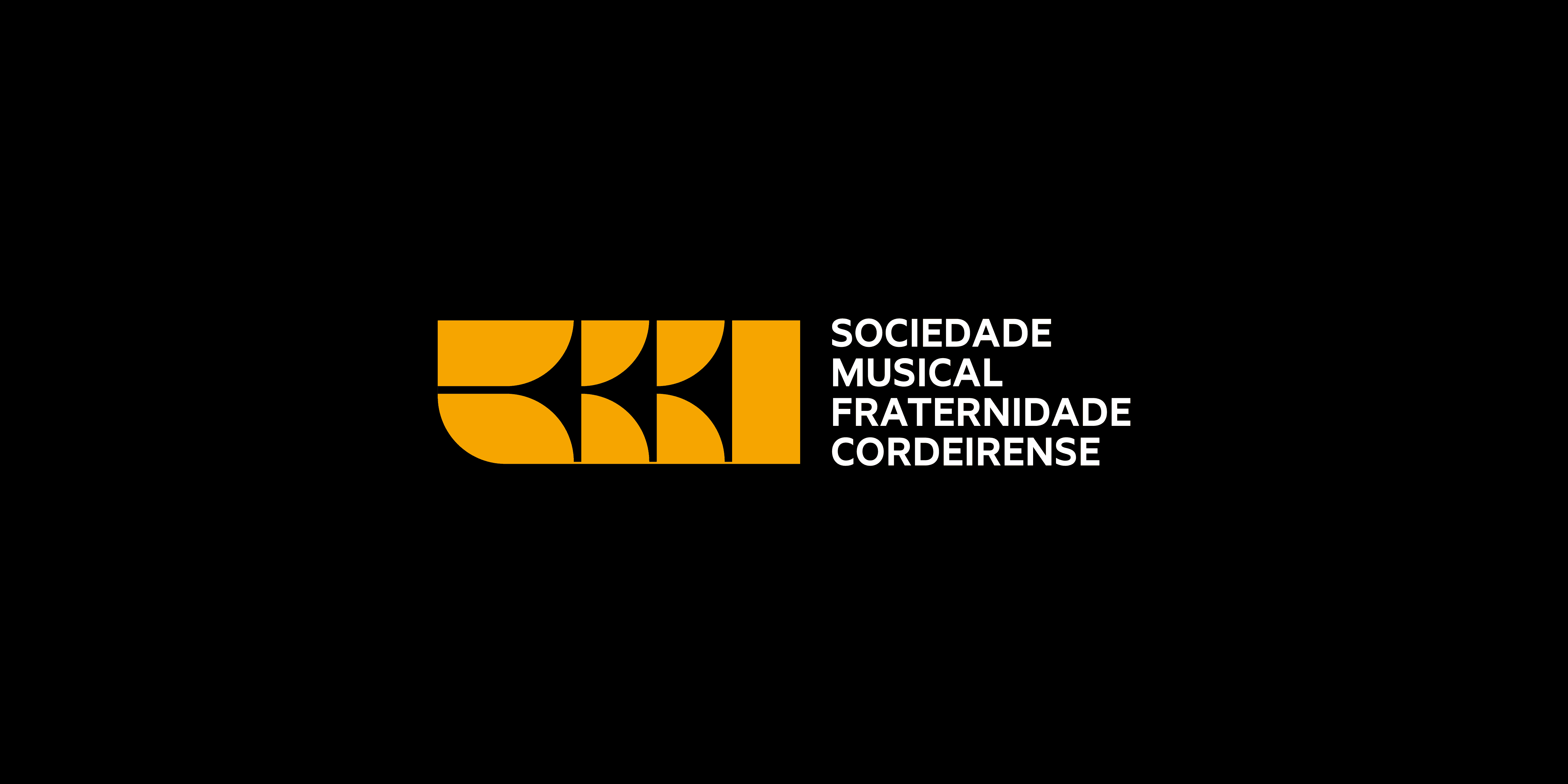
The created symbol is based on the stylization of a wind instrument — an emblematic element of symphonic bands — evoking the musical universe and the idea of a group. Its shape unfolds into visual patterns and structures that enrich the brand's graphic repertoire and reinforce its versatility. The logo's typography is simple and direct, allowing the symbol to take center stage. The color palette is vibrant and expansive, reinforcing the institution's plural, lively, and popular character.
Experience
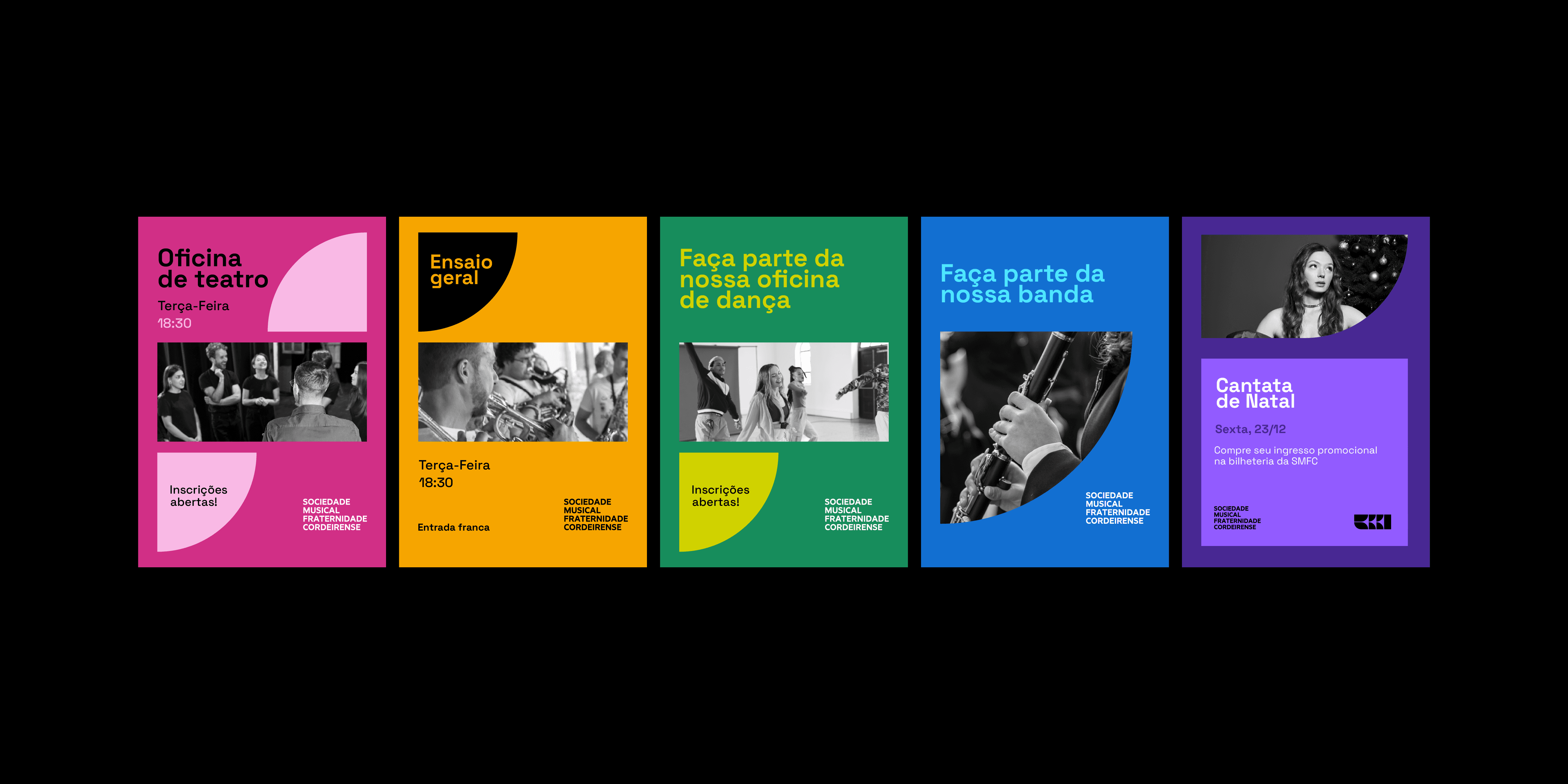
SMFC's new visual identity was designed to occupy different types of spaces: physical, digital, institutional, and emotional. Its application ranges from the musicians' uniforms to signage, commemorative materials, and promotional communication. The visual system is adaptable, allowing for various interpretations and combinations. The result is a brand that represents SMFC as it is today: diverse, welcoming, proudly local, and in constant motion.
Context & Challenge
With a strong cultural and historical presence in the city of Cordeiro, the Sociedade Musical Fraternidade Cordeirense (SMFC) — known as the city's band since 1905 — sought a new visual identity capable of representing its symbolic and social relevance. The challenge was to visually translate the band's tradition without giving up innovation, the diversity of people involved, and the community dynamics that SMFC represents today.
Diagnosis
During the immersion process, it became clear that SMFC goes far beyond musical performances: it is an emotional, collective symbol deeply rooted in the city's life. The brand needed to reflect this multiple role — as a living cultural heritage and a generational meeting point — with a current and accessible language, especially for the new generations, without losing the seriousness and prestige built over more than a century.
Strategy
Among the proposed paths, the chosen one was “Musical Geometrics”. This direction stemmed from the idea of precision and construction — characteristics present in band music — and incorporated formal references to geometry and musical metrics. The goal was to create a coherent and flexible visual system that expressed organization, continuity, and transformation, connecting SMFC's tradition to its contemporary role in Cordeiro's life.
Language
The created symbol is based on the stylization of a wind instrument — an emblematic element of symphonic bands — evoking the musical universe and the idea of a group. Its shape unfolds into visual patterns and structures that enrich the brand's graphic repertoire and reinforce its versatility. The logo's typography is simple and direct, allowing the symbol to take center stage. The color palette is vibrant and expansive, reinforcing the institution's plural, lively, and popular character.
Experience
SMFC's new visual identity was designed to occupy different types of spaces: physical, digital, institutional, and emotional. Its application ranges from the musicians' uniforms to signage, commemorative materials, and promotional communication. The visual system is adaptable, allowing for various interpretations and combinations. The result is a brand that represents SMFC as it is today: diverse, welcoming, proudly local, and in constant motion.