Papo de Feira
A brand that is good at chatting
Year
2024
Category
Brand Identity
Country
Brazil
Context & Challenge
Papo de Feira was born with the proposal to recreate, in a gastronomic space, the vibrant and welcoming energy of a Rio street market. More than offering iconic food and drinks like pastel and sugarcane juice, the goal was to create an environment for gathering, conversation, and joy. The challenge was to develop a visual identity that conveyed this unique atmosphere, balancing playfulness and friendliness, while being simple, memorable, and full of personality.
Diagnosis
The immersion revealed the importance of visually translating not only street gastronomy, but also the relaxed atmosphere, human warmth, and Rio spirit that the project wished to offer. It was necessary to create a symbol that stood out, communicated proximity, and had the potential to become a recognizable icon across different touchpoints.
Strategy
The chosen creative path was the “Rio Symbol”, inspired by typical elements of street markets and the dynamics of conversations between friends. The proposal was to create a simple and unique symbol that gathered multiple references: the rectangular shape of market crates, the shape of speech bubbles, and the brand's initials — “P” and “F”. The result is a visual system that conveys a relaxed feel and local identity, while maintaining clarity and versatility.
Language
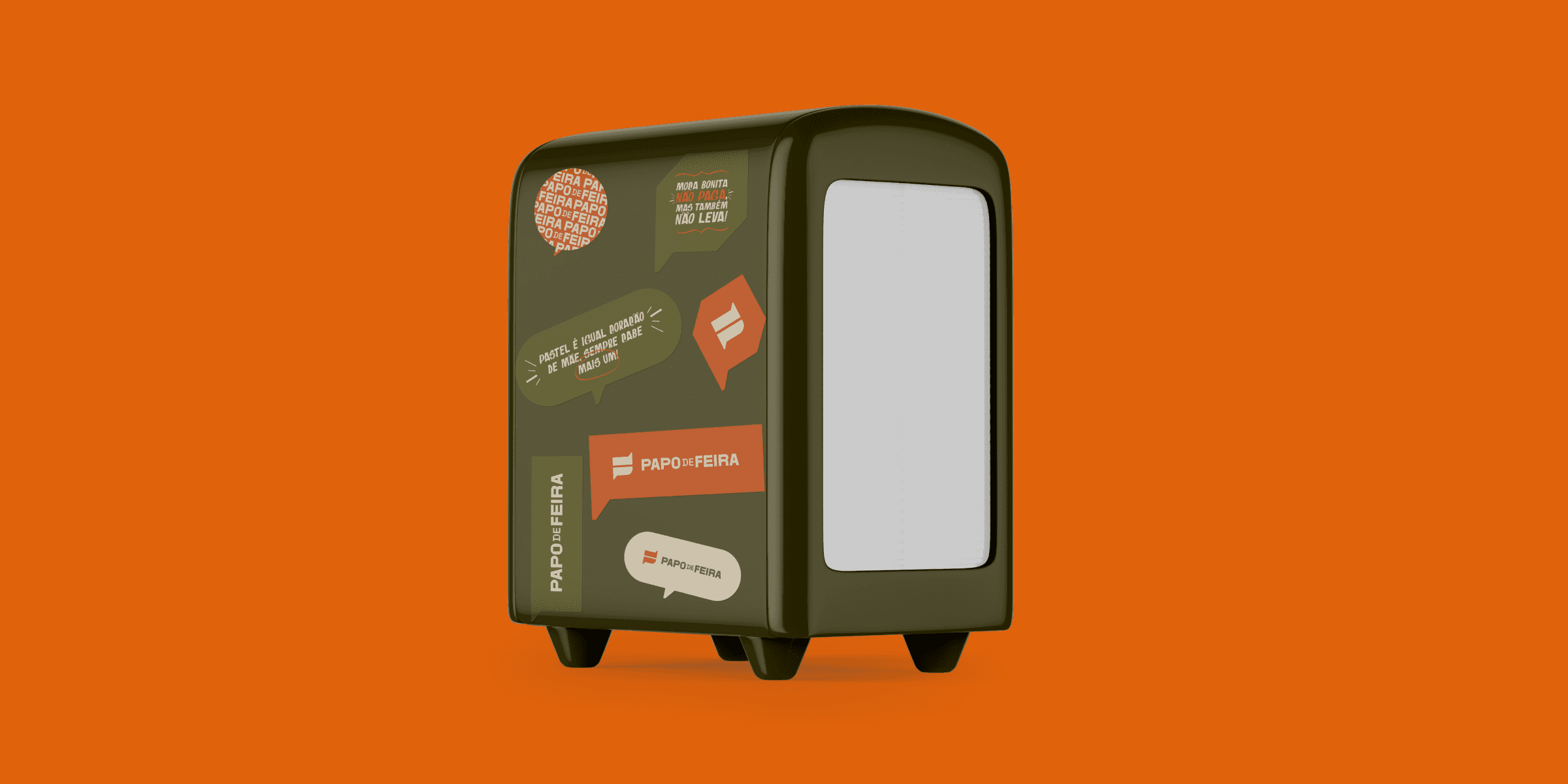
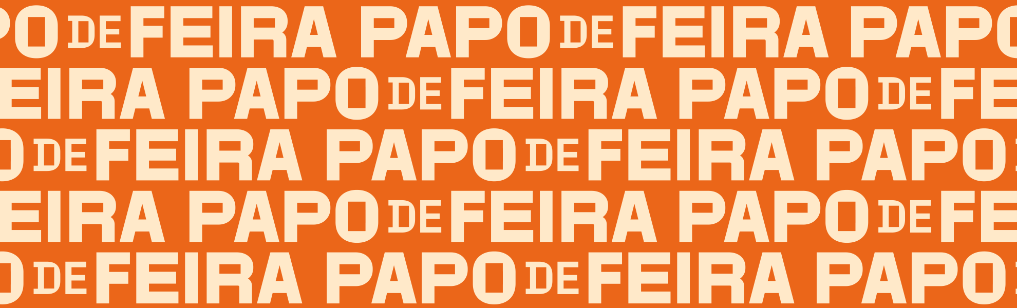
The Papo de Feira symbol is constructed from a rectangle, reinterpreted as a market crate, which incorporates speech bubbles — representing the essence of “papo” (chat) — and the brand's initial letters. The logo is robust, with balanced weights and fine-tuned spacing, ensuring readability and presence. The vibrant color palette reinforces the energy and joy of the concept, creating an identity that adapts to both physical and digital applications.
Experience
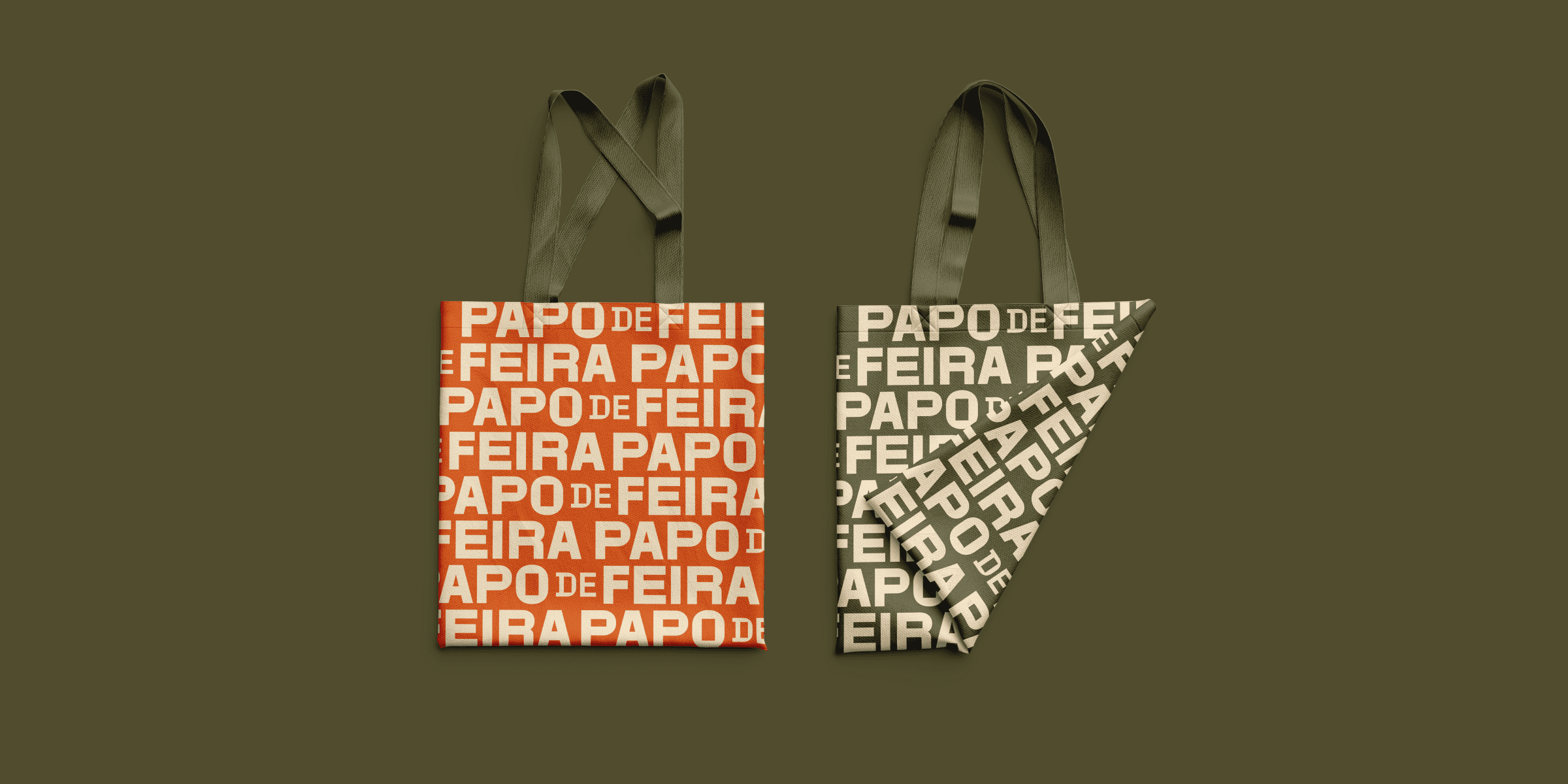
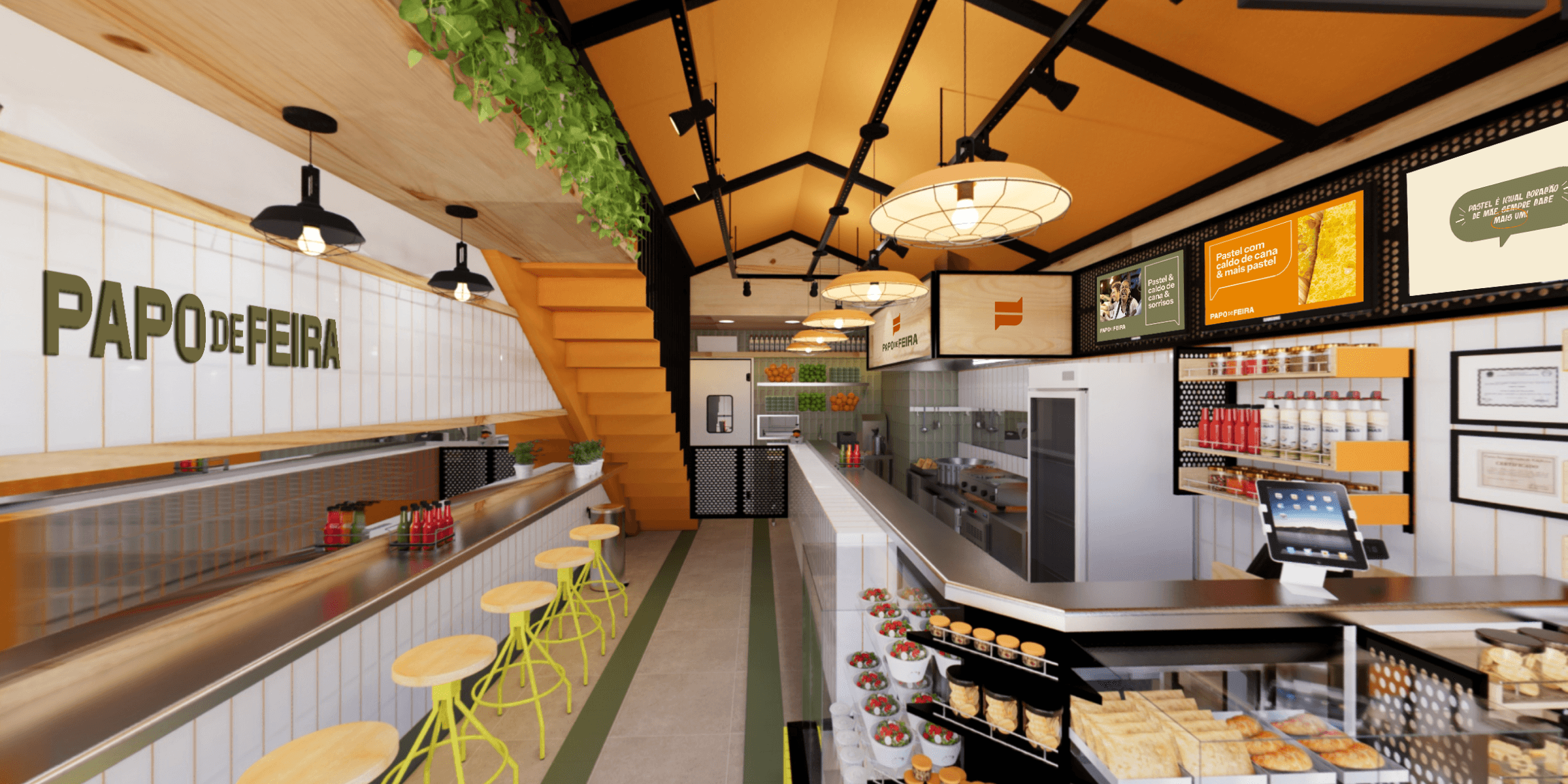
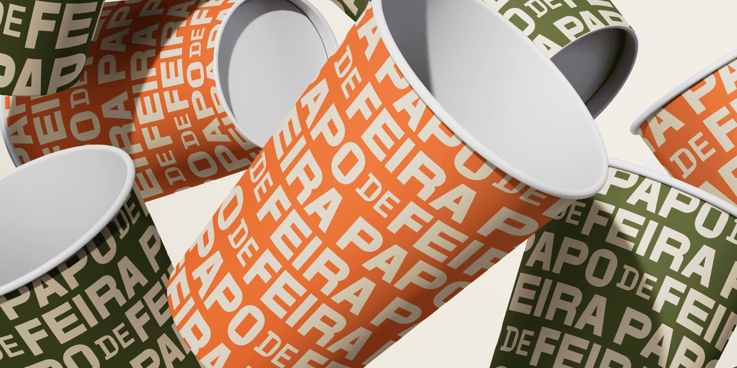
The visual identity was designed to work in various contexts, from the facade and internal signage to packaging, menus, and digital communication. The versatility of the symbol and the graphic system allows its application in different formats, always maintaining the light, playful, and welcoming essence of Papo de Feira.
Context & Challenge
Papo de Feira was born with the proposal to recreate, in a gastronomic space, the vibrant and welcoming energy of a Rio street market. More than offering iconic food and drinks like pastel and sugarcane juice, the goal was to create an environment for gathering, conversation, and joy. The challenge was to develop a visual identity that conveyed this unique atmosphere, balancing playfulness and friendliness, while being simple, memorable, and full of personality.
Diagnosis
The immersion revealed the importance of visually translating not only street gastronomy, but also the relaxed atmosphere, human warmth, and Rio spirit that the project wished to offer. It was necessary to create a symbol that stood out, communicated proximity, and had the potential to become a recognizable icon across different touchpoints.
Strategy
The chosen creative path was the “Rio Symbol”, inspired by typical elements of street markets and the dynamics of conversations between friends. The proposal was to create a simple and unique symbol that gathered multiple references: the rectangular shape of market crates, the shape of speech bubbles, and the brand's initials — “P” and “F”. The result is a visual system that conveys a relaxed feel and local identity, while maintaining clarity and versatility.
Language
The Papo de Feira symbol is constructed from a rectangle, reinterpreted as a market crate, which incorporates speech bubbles — representing the essence of “papo” (chat) — and the brand's initial letters. The logo is robust, with balanced weights and fine-tuned spacing, ensuring readability and presence. The vibrant color palette reinforces the energy and joy of the concept, creating an identity that adapts to both physical and digital applications.
Experience
The visual identity was designed to work in various contexts, from the facade and internal signage to packaging, menus, and digital communication. The versatility of the symbol and the graphic system allows its application in different formats, always maintaining the light, playful, and welcoming essence of Papo de Feira.