Fit na Caixa
Movement as visual language
Year
2024
Category
Brand Identity
Country
Brazil
Context & Challenge
FitnaCaixa is more than a fitness fashion brand: it is a movement that empowers women through style, authenticity, and purpose. Its commitment goes beyond clothing and extends to building a community that inspires, connects, and encourages women to feel secure, strong, and confident in their daily journeys. The challenge of this project was to create a visual identity that translated this collective strength with lightness, movement, and personality, avoiding visual clichés from the fitness universe and conveying the values of trust, respect, and freedom of expression.
Diagnosis
During the immersion process, it became clear that FitnaCaixa needed a visual language with rhythm, fluidity, and emotional connection. The brand required an identity that spoke to real, diverse women while conveying both security and authenticity. Market analysis revealed a landscape saturated with generic and predictable brands, reinforcing the need to create a singular and inspiring proposal.
Strategy
The creative strategy started from the concept of movement—understood not only as physical displacement, but as transformation and drive. The chosen visual path, called "Move Yourself," inspired the development of an identity with a dynamic, gestural, and flexible structure. The proposal was to create a visually alive brand, capable of adapting to different formats and reflecting the intense, multifaceted, and real rhythm of the women it represents.
Language
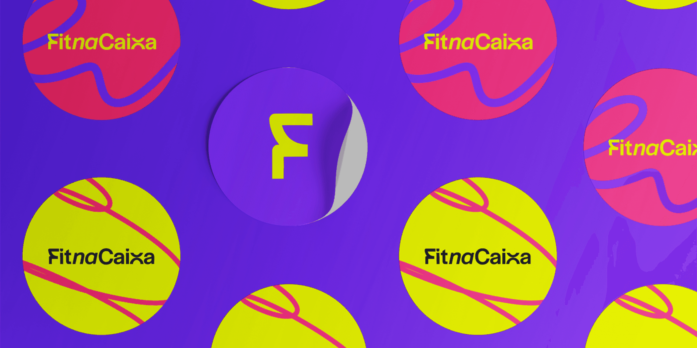
FitnaCaixa's logo is fluid, with organic shapes and compositions that suggest continuity and transformation. The visual system is composed of mobile, modular graphic elements that can unfold into diverse applications, reinforcing the idea that the brand is always in motion. The color palette is vibrant and feminine without being obvious, offering bold and versatile combinations. The whole set conveys energy and freedom without sacrificing sophistication.
Experience
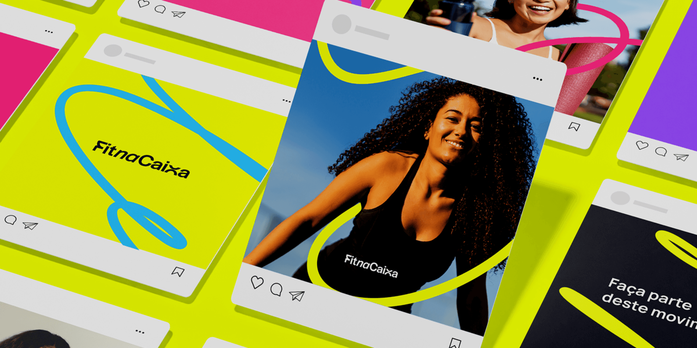
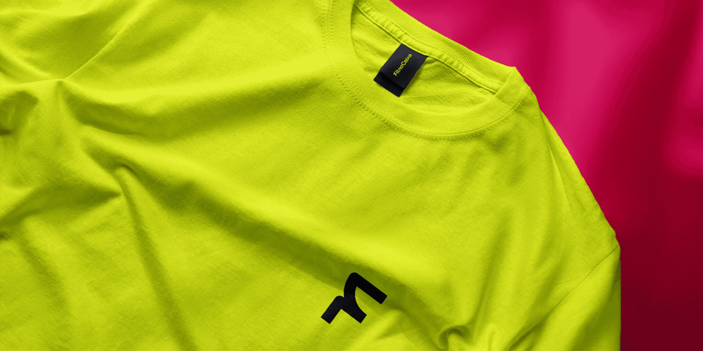
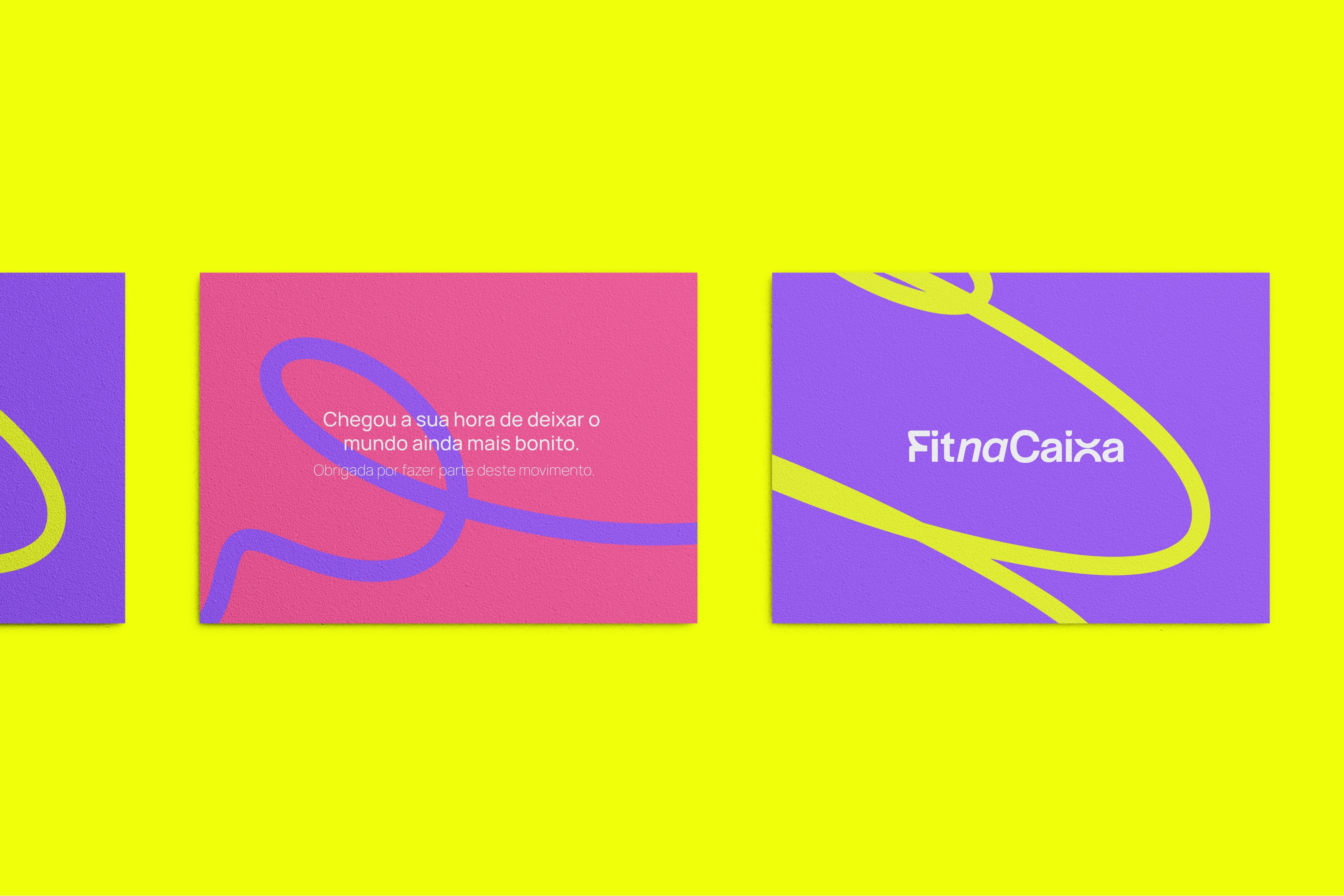
FitnaCaixa's visual identity was designed to come to life across all touchpoints: labels, graphic materials, social media, and physical and digital environments. The applications demonstrate the system’s versatility and its ability to communicate with consistency and personality. The result is a brand that not only dresses women, but also accompanies and represents real women in constant evolution.
Context & Challenge
FitnaCaixa is more than a fitness fashion brand: it is a movement that empowers women through style, authenticity, and purpose. Its commitment goes beyond clothing and extends to building a community that inspires, connects, and encourages women to feel secure, strong, and confident in their daily journeys. The challenge of this project was to create a visual identity that translated this collective strength with lightness, movement, and personality, avoiding visual clichés from the fitness universe and conveying the values of trust, respect, and freedom of expression.
Diagnosis
During the immersion process, it became clear that FitnaCaixa needed a visual language with rhythm, fluidity, and emotional connection. The brand required an identity that spoke to real, diverse women while conveying both security and authenticity. Market analysis revealed a landscape saturated with generic and predictable brands, reinforcing the need to create a singular and inspiring proposal.
Strategy
The creative strategy started from the concept of movement—understood not only as physical displacement, but as transformation and drive. The chosen visual path, called "Move Yourself," inspired the development of an identity with a dynamic, gestural, and flexible structure. The proposal was to create a visually alive brand, capable of adapting to different formats and reflecting the intense, multifaceted, and real rhythm of the women it represents.
Language
FitnaCaixa's logo is fluid, with organic shapes and compositions that suggest continuity and transformation. The visual system is composed of mobile, modular graphic elements that can unfold into diverse applications, reinforcing the idea that the brand is always in motion. The color palette is vibrant and feminine without being obvious, offering bold and versatile combinations. The whole set conveys energy and freedom without sacrificing sophistication.
Experience
FitnaCaixa's visual identity was designed to come to life across all touchpoints: labels, graphic materials, social media, and physical and digital environments. The applications demonstrate the system’s versatility and its ability to communicate with consistency and personality. The result is a brand that not only dresses women, but also accompanies and represents real women in constant evolution.