Break
More than a restaurant, Break is an experience and connection.
Year
2021
Category
Brand Identity
Country
Brazil
Context & Challenge
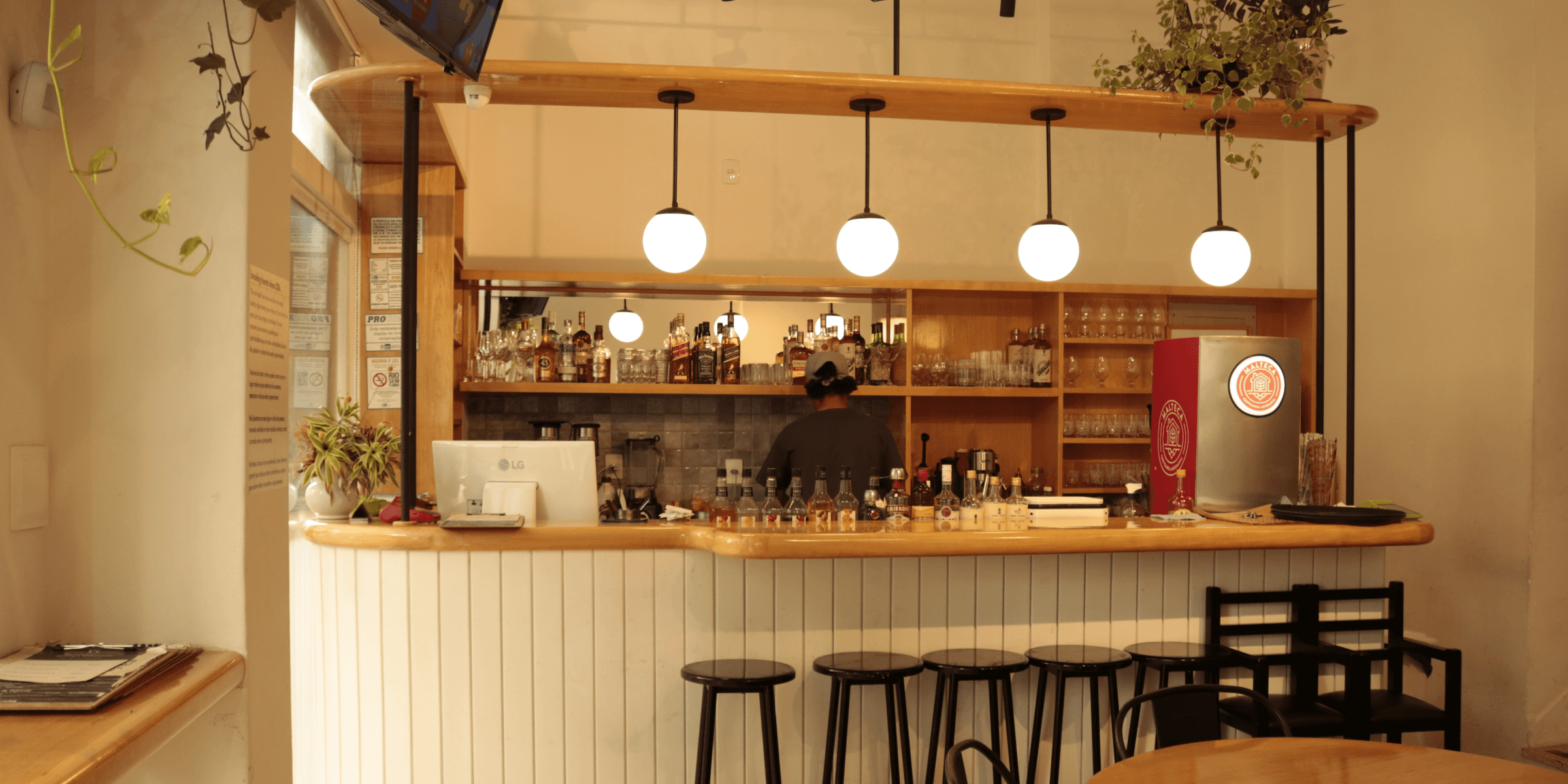
Break is a restaurant and bar in Niterói that combines good food, draft beers, and moments of relaxation. More than a dining space, it is a meeting point among friends, where food, atmosphere, and design connect to create light and memorable experiences. The challenge was to develop a visual identity that translated this urban and welcoming essence, avoiding clichés from the burger universe and delivering an authentic, vibrant, and versatile look.
Diagnosis
The initial analysis pointed to the need to create a visual identity capable of representing Break’s collective and laid-back spirit. The brand needed to clearly communicate the balance between energy and lightness — a modern, unpretentious environment made to bring people together. The diagnosis highlighted the brand’s potential to become a strong visual reference in the local scene.
Strategy
The creative strategy was based on the concept of gathering. Above all, Break is a space for shared pauses — where time slows down and conversations flow. The identity needed to reflect this idea of connection and casualness, expressing energy without losing balance. The brand was built to be versatile, spanning from the physical environment to the digital and promotional universe, with consistency and charisma.
Language
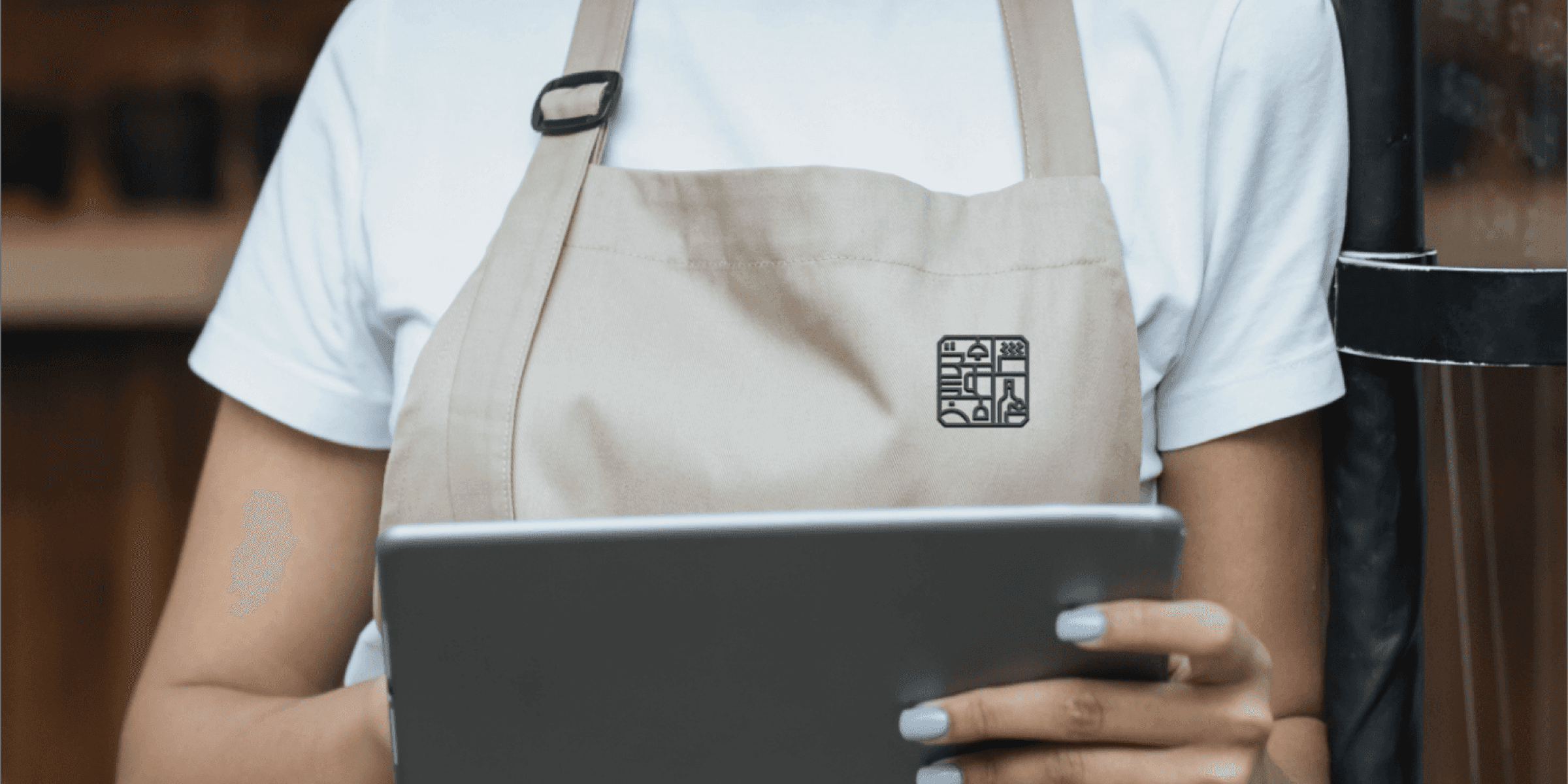
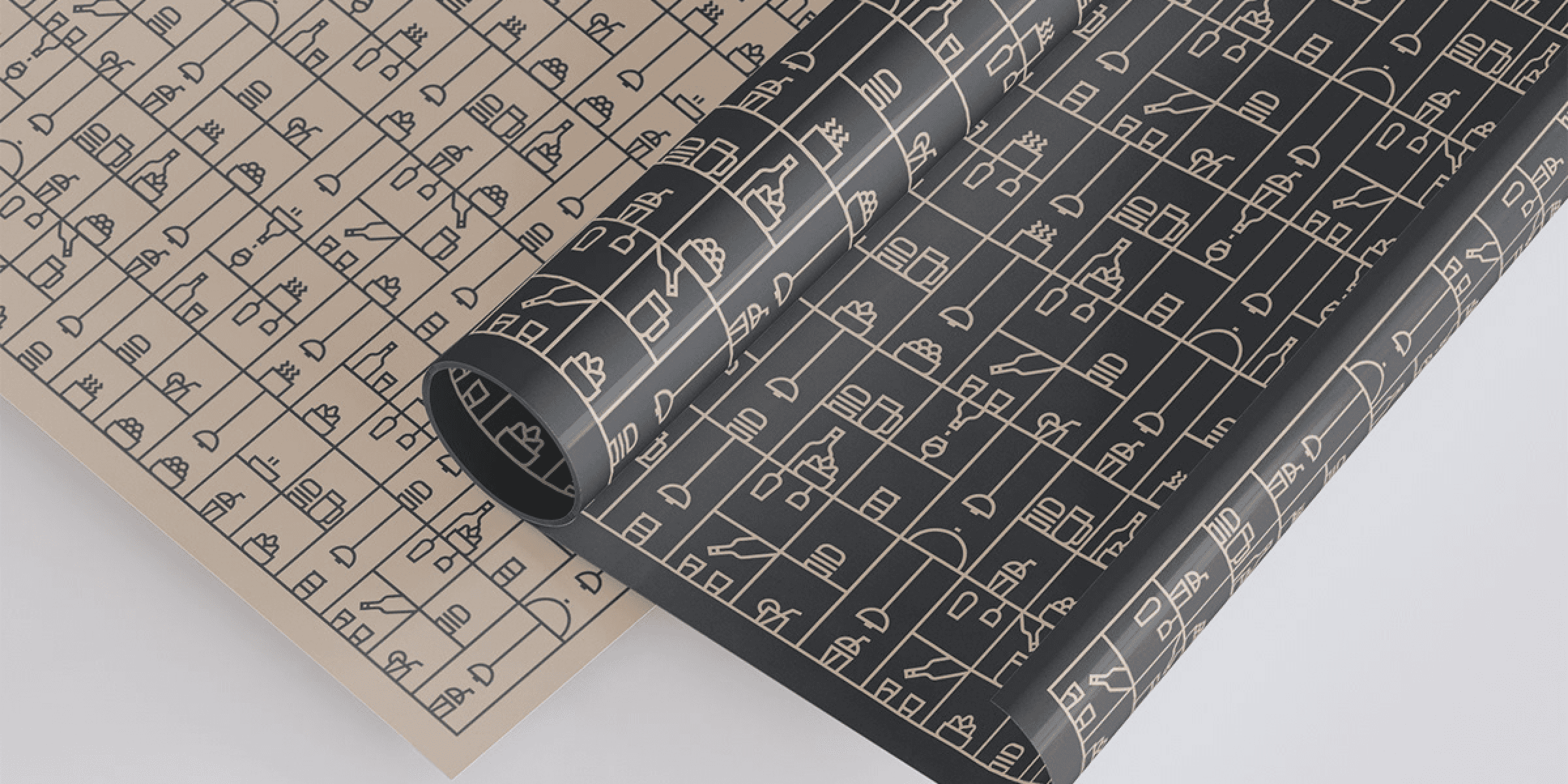
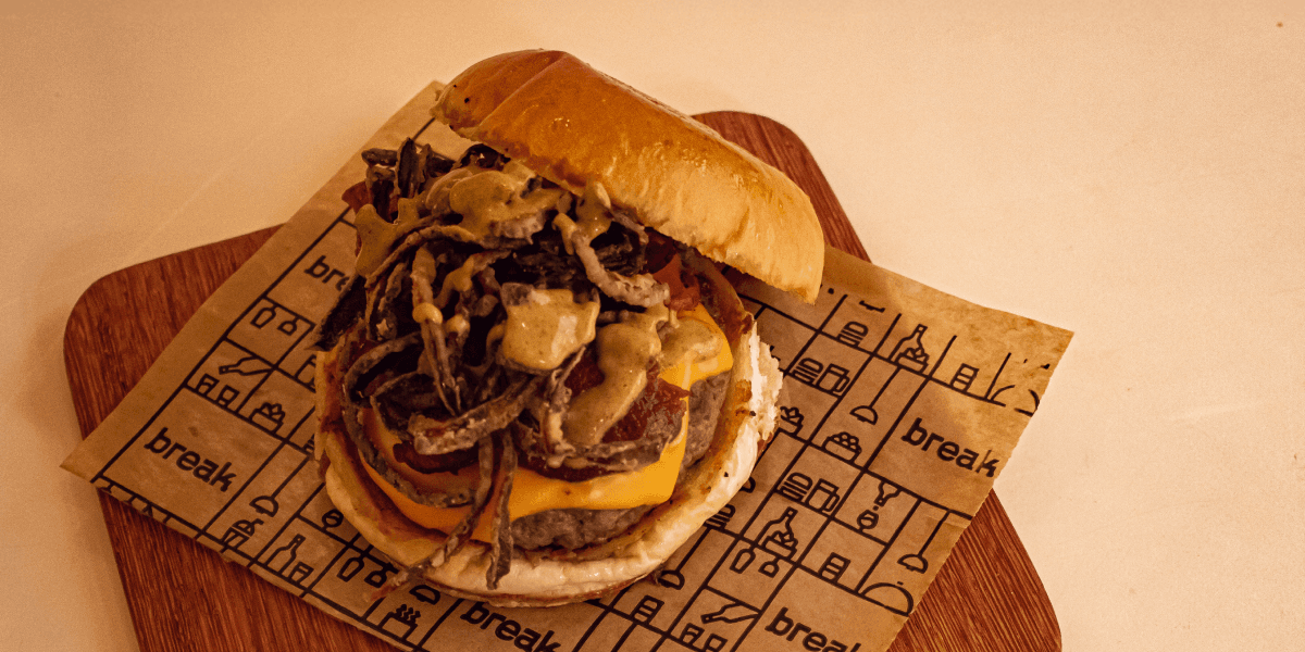
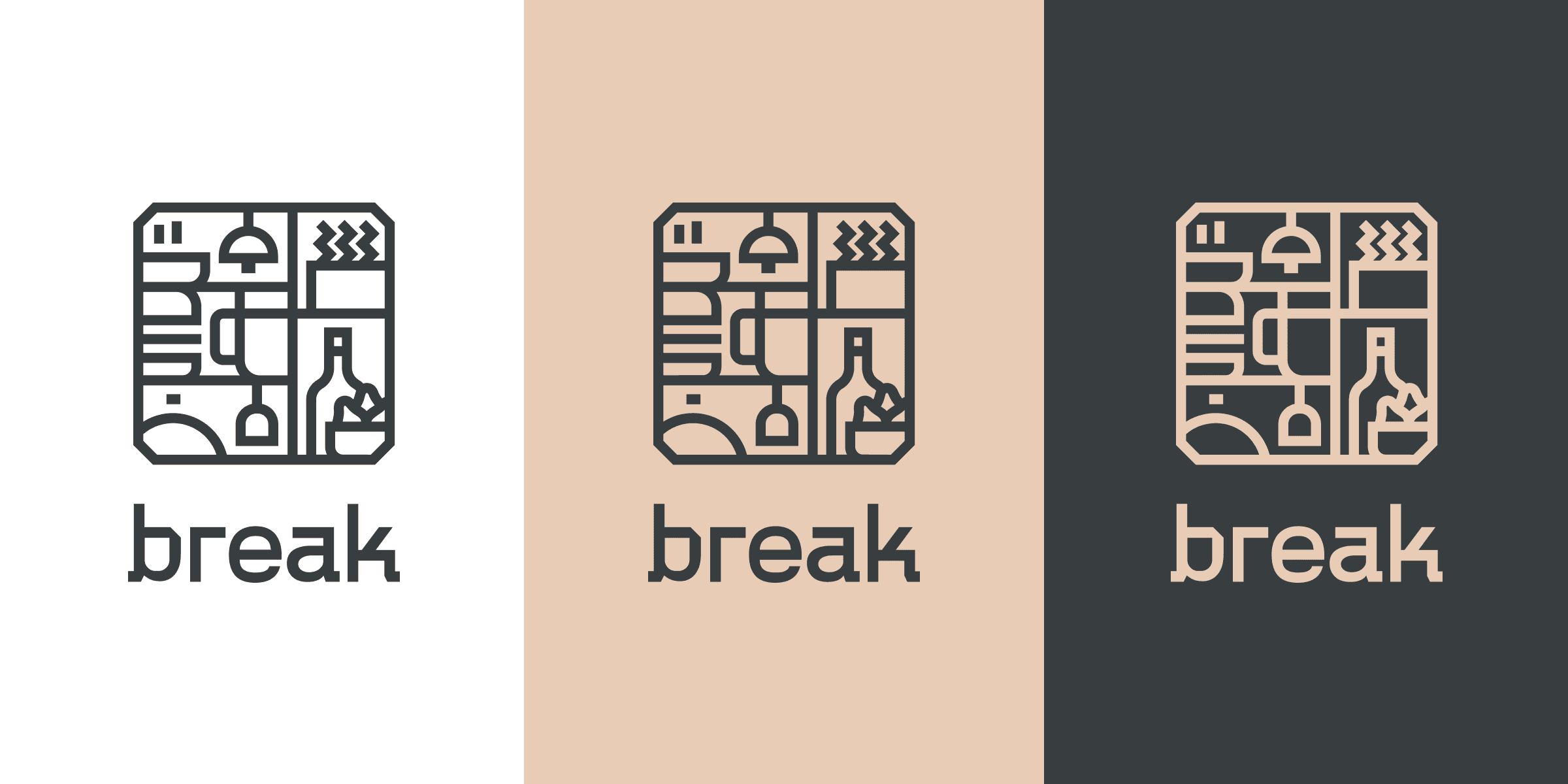
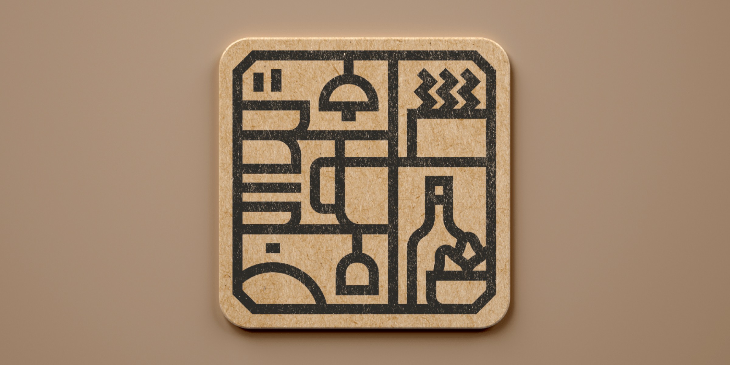
The logo features robust, geometric typography, conveying confidence and presence. The composition is direct and striking, reinforcing the brand’s urban character. Minimalist icons and pictograms complement the graphic system, evoking elements from the restaurant’s daily life: glasses, plates, laughter, and moments of relaxation. The color palette combines neutral and elegant tones, balancing energy and visual warmth, while the clean layout enhances content and experience.
Experience
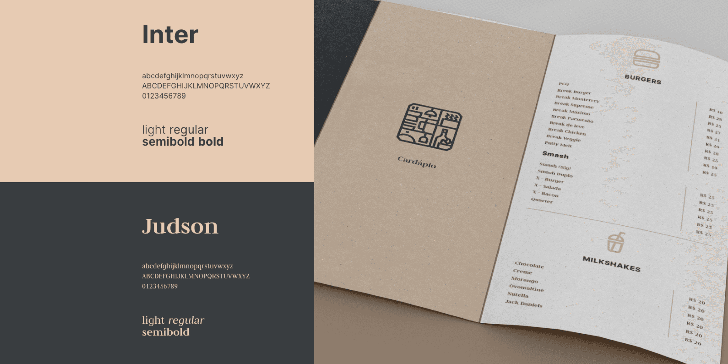
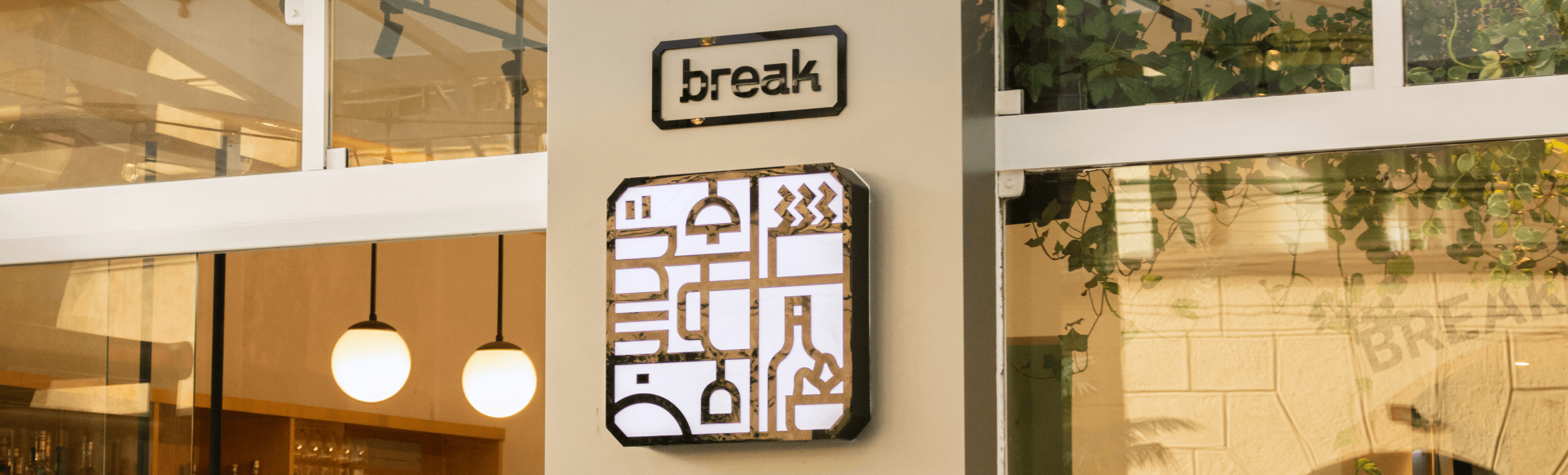
The visual identity was designed to integrate perfectly with Break’s atmosphere: informal, vibrant, and authentic. Across packaging, menus, signage, and social media, the visual language maintains coherence and closeness, reinforcing the invitation to live simple and memorable moments. The result is a brand with a strong personality and a light spirit — a faithful portrait of a place made for eating well, toasting, and sharing good stories.
Context & Challenge
Break is a restaurant and bar in Niterói that combines good food, draft beers, and moments of relaxation. More than a dining space, it is a meeting point among friends, where food, atmosphere, and design connect to create light and memorable experiences. The challenge was to develop a visual identity that translated this urban and welcoming essence, avoiding clichés from the burger universe and delivering an authentic, vibrant, and versatile look.
Diagnosis
The initial analysis pointed to the need to create a visual identity capable of representing Break’s collective and laid-back spirit. The brand needed to clearly communicate the balance between energy and lightness — a modern, unpretentious environment made to bring people together. The diagnosis highlighted the brand’s potential to become a strong visual reference in the local scene.
Strategy
The creative strategy was based on the concept of gathering. Above all, Break is a space for shared pauses — where time slows down and conversations flow. The identity needed to reflect this idea of connection and casualness, expressing energy without losing balance. The brand was built to be versatile, spanning from the physical environment to the digital and promotional universe, with consistency and charisma.
Language
The logo features robust, geometric typography, conveying confidence and presence. The composition is direct and striking, reinforcing the brand’s urban character. Minimalist icons and pictograms complement the graphic system, evoking elements from the restaurant’s daily life: glasses, plates, laughter, and moments of relaxation. The color palette combines neutral and elegant tones, balancing energy and visual warmth, while the clean layout enhances content and experience.
Experience
The visual identity was designed to integrate perfectly with Break’s atmosphere: informal, vibrant, and authentic. Across packaging, menus, signage, and social media, the visual language maintains coherence and closeness, reinforcing the invitation to live simple and memorable moments. The result is a brand with a strong personality and a light spirit — a faithful portrait of a place made for eating well, toasting, and sharing good stories.